Key Takeaways
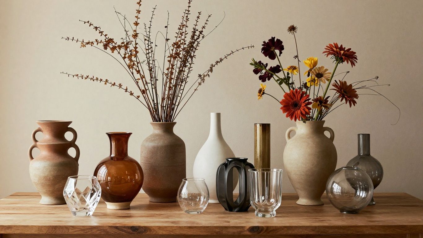
The right vase can add height, color, texture, or a quiet sculptural note without making a room feel crowded.
- Start with the room, surface, and decorating purpose.
- Match vase materials and finishes to the surrounding palette.
- Choose proportions that suit the furniture and floral stems.
- Group vases with varied heights while preserving breathing room.
- Check stability, cleaning needs, and value before buying.
Define your vase decorating goals
Before shopping for home decor vases, decide what you want them to do. A vase may hold fresh flowers, display dried stems, or stand alone as a decorative object. Your answer will shape its material, opening, scale, and placement. It also keeps an attractive piece from becoming an awkward fit.
Decide between function and display
A working vase needs a waterproof interior, a stable base, and an opening suited to the stems you use. A display-only piece can be chosen more freely for its silhouette or surface detail, though it should still be secure where it sits. If you frequently bring home flowers, prioritize easy filling and cleaning over an especially delicate shape.
For a purely decorative accent, consider whether the empty vessel looks complete. Sculptural curves, a colored finish, or an unusual profile can carry the arrangement without flowers. The best choice supports the way you actually live rather than requiring constant styling.
Match the vase to your room’s style
Look at the room’s strongest visual language before choosing a vase. Clean-lined furniture often pairs well with simple cylinders or softly geometric forms, while rustic rooms can welcome handmade ceramics, terracotta, or organic shapes. For inspiration beyond vessels, this guide to modern decor home ideas offers useful direction on natural materials, neutral palettes, and uncluttered styling.
Try to echo one existing feature instead of matching everything. A warm vase can pick up wood tones, while a cool glass piece may connect with metal hardware or pale upholstery. A quiet visual echo usually feels more intentional than a collection of unrelated colors.
Choose a focal point or layered arrangement
A single large vase works well when a console, mantel, or open shelf needs one clear point of interest. Smaller vessels are better for a layered arrangement, especially when you want to distribute color across a long surface. Decide whether the eye should land on one object first or move through several pieces.
The surrounding objects matter just as much as the vase. Leave room around a statement piece, and use books, bowls, or a small branch to create a gentle visual path. If the surface already has a large artwork or mirror, a modest vase may support it without competing.
Consider how often you will refresh the decor
If you change flowers weekly, choose a versatile vessel that can handle water, trimming, and repeated washing. If you decorate seasonally, a more expressive vase may earn its place even when it sits empty for months. Think about storage, too, since a tall or fragile piece needs a safe home between displays.
A simple rotation can make a small collection feel fresh. Keep one neutral vase for everyday use, one colorful accent for seasonal stems, and one low vessel for tables. This approach gives you variety without accumulating objects that rarely leave the cabinet.
Explore vase materials and finishes
Material affects more than appearance. It changes how light moves through the room, how heavy the vase feels, and how forgiving it is during everyday use. Consider the nearby textures—wood, linen, stone, upholstery—so the vase adds a new note instead of repeating the same one.

Compare glass, ceramic, metal, and crystal
Glass feels light and reflective, ceramic brings visual weight and often has more surface character, and metal can introduce a crisp or aged accent. Crystal tends to read as especially decorative, whether it holds flowers or stands alone. A useful comparison is available through Kosta Boda crystal vases, which are described as sculptural pieces with expressive Scandinavian design and expert craftsmanship.
The choice should follow the room’s needs. A heavy ceramic vase can anchor a breezy arrangement, while glass may suit a narrow shelf where a solid object would feel dense. Metal works best when its tone appears elsewhere, such as in a lamp, frame, or cabinet pull.
Use transparent vases for an airy look
Transparent vessels allow stems, water, and light to remain part of the composition. They are especially helpful in smaller rooms or on crowded surfaces because they create less visual interruption. Clear glass can also reveal interesting stems, pebbles, or a carefully trimmed root structure.
Keep the contents tidy because transparency leaves little to hide. Change cloudy water promptly, remove stray leaves below the waterline, and avoid overfilling the vessel. For a broader look at different materials and silhouettes, browse this collection of glass and ceramic vases for ideas that range from minimalist to ornate.
Add texture with matte, glazed, or ribbed finishes
A matte finish softens light and often feels calm, while a glossy glaze adds reflection and color intensity. Ribbed, fluted, or hand-shaped surfaces create shadows that remain interesting even without flowers. Texture is useful when the room is mostly neutral and needs detail rather than another strong hue.
Use texture with some restraint. If the vase is heavily patterned, let nearby objects stay relatively quiet; otherwise, the display can lose its visual center. A lightly textured neutral vessel is often more flexible than a highly decorative piece in a bold color.
Balance polished and natural materials
Polished glass, crystal, or metal can look more welcoming beside rougher materials such as woven baskets, unfinished wood, stone, or dried grasses. This contrast prevents a display from feeling too formal or too plain. Aim for a mix that reflects the room rather than a perfectly matched set.
For example, place a glossy vase on a wood console and add a linen runner nearby. Or set a matte ceramic vessel beside a reflective lamp. The balance works because the eye moves between soft, tactile surfaces and sharper highlights.
Select the right vase shape and size
Proportion is often the difference between a vase that looks considered and one that seems misplaced. Measure the surface before buying, then think about what will surround the vessel once it is styled. A beautiful shape still needs enough room to breathe and enough weight to remain steady.
Match vase height to furniture proportions
On a console or sideboard, a tall vase can provide needed height, but it should not overwhelm artwork, mirrors, or lamps above it. Low vessels suit coffee tables and dining surfaces where sightlines matter. As a rough visual guide, vary height rather than placing every object at the same level.
Use the furniture as your starting point. A broad cabinet can support a substantial urn, while a petite table usually looks better with a narrow or low form. Measure both the vase and its intended contents, since branches may add much more height than expected.
Choose narrow necks for single stems
A narrow opening holds one or a few stems upright and gives a sparse arrangement a deliberate appearance. Bud vases are especially useful across a dining table, along a windowsill, or in a small bathroom corner. They also make it easy to display one unusual flower without building a full bouquet.
The neck should support the stem without squeezing it. If the opening is too tight, the flower can look trapped; if it is too wide, a single stem may lean awkwardly. Test the visual balance with the vase empty before adding foliage.
Use wide openings for branches and bouquets
Wide-mouth vases allow branches and generous bouquets to spread naturally. They are useful when you want an abundant, relaxed arrangement rather than a tightly controlled line. Their broader base also helps distribute weight, though a top-heavy branch still needs attention.
Trim stems gradually and turn the vase as you work. This makes it easier to find a pleasing outline from the room’s main viewing angles. For more vessel variety, decorative flower vases can inspire combinations of modern minimalist forms and more ornate statement pieces.
Combine different shapes without creating clutter
Grouping different silhouettes adds rhythm, but every piece needs a role. Pair a rounded vase with a column-like form, then soften the transition with a smaller bud vase or a low bowl. Repeating one color or material keeps the varied shapes connected.
A useful test is to remove one object after arranging the group. If the display looks clearer, the extra piece was probably competing rather than contributing. The goal is a layered composition, not a crowded shelf.
Style home decor vases by room
Each room asks for a slightly different kind of arrangement. Entryways benefit from a welcoming first impression, living rooms can handle stronger sculptural accents, and dining rooms need clear sightlines. Bedrooms and bathrooms usually respond well to smaller, softer details.

Create an inviting entryway arrangement
An entryway vase should look good from a distance and fit comfortably on the available surface. Choose a stable medium-height piece for a console, then pair it with one or two practical objects such as a tray or bowl. A few branches can add movement without requiring a dense bouquet.
Keep the arrangement away from the edge and leave space for keys, bags, or daily routines. If the entry has limited light, dried stems or a display-only vase may be more dependable than fresh flowers. The first view into the home should feel composed, not precious.
Add height and color to living room surfaces
A living room offers several places for a vase: a mantel, media console, bookshelf, coffee table, or side table. Use height to balance low furniture, or choose a strong silhouette that can hold its own beside framed art. A color accent works best when it repeats a tone found in a cushion, rug, painting, or nearby object.
Avoid placing tall vessels where they interrupt a screen or the view across the room. On open shelving, alternate filled and empty vases so the display does not become too floral. A useful home decor art guide can also help you think about focal points, scale, and how decorative objects relate to wall pieces.
Decorate dining tables without blocking conversation
Dining arrangements should stay low enough for guests to see one another comfortably. Try a row of small vases, a low bowl, or a single broad vessel with trimmed stems. Repeating a shape along the table creates continuity while keeping each place setting clear.
Check the arrangement from a seated position, not just while standing. Leave generous space for serving dishes and keep fragile pieces away from busy edges. If you want more height, move it to a nearby sideboard rather than forcing it into the center of the table.
Bring softness to bedrooms and bathrooms
Bedrooms often suit muted ceramics, pale glass, or a small vase holding one delicate stem. Place it on a dresser, bedside table, or shelf where it will not interfere with movement. In a bathroom, choose a compact vessel that tolerates humidity and can be wiped clean easily.
A vase can also soften hard bathroom surfaces such as tile, stone, and metal. For ideas about making a bathroom both useful and visually calm, see these luxury bathroom vanities, which discuss materials, lighting, mirrors, and focal-point design. Keep water away from electrical fixtures and porous surfaces.
Build attractive vase arrangements
Good arrangements have a clear outline, a sense of movement, and enough open space to keep individual elements visible. Start with the vessel, then add the largest or strongest stem before filling gaps. Step back often; small adjustments look different from across the room.
Use the rule of three for grouped vases
Three related vessels often create an easy, asymmetrical grouping: one tall, one medium, and one low. They do not need to be identical, but a shared color, finish, or material helps them read as a set. Two pieces can work too, though they usually need stronger contrast in height or shape.
Place the tallest object slightly off-center rather than lining everything up. Then angle the smaller pieces toward it without making the group perfectly symmetrical. This gives the arrangement a natural pause and direction.
Layer heights, colors, and silhouettes
Layering works when each level remains legible. Put the tallest vase toward the back, a medium piece in the middle, and a low object near the front. Keep the strongest color in one or two places so the eye has somewhere to settle.
The same principle applies to shape. A smooth round vase can sit beside a tall angular one, while a ribbed piece adds another layer of shadow. This is a good place to draw inspiration from home decor gift ideas, especially suggestions involving minimalist ceramics, sculptural candles, and natural materials.
Mix flowers, branches, and dried stems
Fresh flowers bring color and softness, branches add height and line, and dried stems contribute lasting texture. Combining two of these categories is often enough; using all three can work when the palette is restrained. Choose materials with different silhouettes so the arrangement does not become a single dense mass.
Condition each stem before placing it. Strip leaves below the waterline, trim at an angle, and give branches room to extend. Dried elements can remain outside the water in a separate vessel or be grouped with fresh stems only when the arrangement allows both to stay clean and dry.
Leave intentional negative space
Empty space is part of the design, not a sign that the arrangement is unfinished. Gaps around stems reveal the vase, keep colors from blending together, and make a display feel lighter. Negative space is especially valuable on shelves and small tables.
If the arrangement feels busy, remove rather than add. Turn the vase, shorten one stem, or separate two objects by an inch or two. Those small changes often restore the original shape and make the focal point easier to see.
Coordinate vases with color and decor
Color coordination does not require an exact match. It is usually enough to repeat a nearby tone, connect two materials, or introduce one controlled contrast. Consider the room in daylight and at night, since glass and glossy finishes can change noticeably under artificial light.
Match vases to your existing color palette
Begin with the largest colors in the room, such as walls, rugs, sofas, or curtains. A vase can repeat one of those shades for a quiet, cohesive effect, or use a lighter or darker version to add depth. Neutral vases are useful when the flowers themselves provide the color.
For shopping inspiration, home decor stores can help you compare styles, dimensions, materials, and price ranges before committing to a particular piece. Save a photo of your room while browsing so the color decision stays grounded in the space.
Create contrast with complementary shades
Contrast gives a vase presence, especially against a pale wall or neutral furniture. Blue-green tones can stand out against warm terracotta and wood, while amber or rust can enliven cooler gray surroundings. Keep the contrast focused on one object if the room already has several patterns.
Shape can provide contrast too. A soft rounded vase beside straight-edged furniture creates interest without adding another vivid color. This approach is helpful when you prefer a calm palette but still want the display to be noticed.
Combine seasonal colors without overdecorating
Seasonal styling can be subtle: a few ochre leaves in fall, pale branches in spring, or deep green foliage in winter. Change the contents before replacing the vessel, since a versatile vase can work throughout the year. One seasonal accent usually feels fresher than a full collection of themed objects.
Store delicate seasonal pieces together and label the container by room or size. A rotating selection keeps shelves from becoming overfilled. It also makes decorating feel manageable rather than like a complete reset every few months.
Repeat materials and finishes across the room
Repeating a finish gives a room continuity. If a vase has aged brass details, echo that tone in a frame or lamp; if it has a ribbed ceramic surface, repeat texture in a planter or bowl. The repetition can be small, but it should be visible enough to connect the objects.
Avoid buying an entire matching set. A room feels more collected when the materials relate without being identical. Let one vase introduce a new note, then repeat that note elsewhere only if it genuinely suits the space.
Shop for durable and practical vases
Shopping well means considering the vase after the initial excitement fades. Look at how it will be carried, filled, cleaned, stored, and protected from everyday bumps. A practical piece can still be beautiful; it simply earns its place through reliable use as well as appearance.
Check stability and weight distribution
A vase should have a base wide enough for its height and contents. Tall, narrow vessels may need extra care if they will hold branches, while lightweight glass can be risky in a busy hallway. Gently test whether the piece wobbles before buying it.
For shelves and tables used by children or pets, favor lower centers of gravity and heavier bases. Place top-heavy arrangements toward the back of a surface, and use discreet supports when necessary. Stability is part of good styling because it lets the arrangement remain undisturbed.
Choose easy-to-clean surfaces
Smooth glazed ceramic, glass, and sealed metal are generally simpler to wipe than deeply textured or porous finishes. Check the opening as well: a narrow neck can make it difficult to remove residue. If you plan to use fresh flowers, cleaning access matters as much as the outside appearance.
These practical details can guide your spending. A vase that looks wonderful but is frustrating to wash may become a display-only piece by accident. For broader shopping context, home decor catalogs can be useful for comparing visual styles before you narrow down dimensions and materials.
Look for waterproof interiors and protective bases
Not every decorative vessel is designed to hold water. Look for a sealed interior or use a separate watertight liner when the construction is porous or metal. A felt, cork, or rubber base can protect wood and painted surfaces from scratches and moisture rings.
Ask about care instructions before bringing a piece home. Some finishes can spot, tarnish, or react to cleaning products. A little caution preserves both the vase and the surface beneath it.
Set a budget for statement and accent pieces
Use the budget to assign roles. Spend more on one substantial statement vase if it will anchor a room, and choose simpler accent pieces for shelves, bathrooms, or seasonal rotations. This creates variety without requiring every vessel to be a major purchase.
Price should be weighed against construction, scale, and frequency of use. A durable everyday vase may offer better value than a delicate object that only suits one arrangement. If you are shopping during promotions, an interior decor sales guide offers ideas for setting priorities, comparing materials, and checking return policies.
A simple comparison can keep the decision clear:
| Vase type | Best use | Main strength | Watch for |
|---|---|---|---|
| Bud vase | Single stems and table groups | Precise, compact styling | Narrow openings can be hard to clean |
| Ceramic urn | Branches and focal displays | Weight and visual presence | Porous interiors or heavy proportions |
| Clear glass cylinder | Fresh flowers and airy rooms | Versatility and lightness | Visible water and fingerprints |
| Low bowl vase | Dining tables and coffee tables | Keeps sightlines open | Arrangements can spread too widely |
After comparing the options, choose the piece that fits your actual routine and surface. The most successful vase is not always the most dramatic one; it is the one that looks natural in the room and remains easy to live with.
Conclusion
Choosing home decor vases becomes much easier when you begin with purpose, then work through proportion, material, placement, and care. A thoughtful mix of heights and textures can make a room feel finished without making it feel crowded. Start with one well-suited vessel, observe how it changes the space, and build from there.
Frequently Asked Questions
What size vase is best for a living room?
Choose a size that balances the furniture and nearby objects. Tall vases suit consoles and shelves, while low vessels work better on coffee tables or side tables where they will not interrupt views.
Should a vase match the room exactly?
No. Repeating one existing color or finish is often enough to create cohesion. A related shade or complementary material can add more interest than an exact match.
What vase shape is best for a single flower?
A narrow-necked bud vase usually supports one stem neatly. Select an opening that holds the stem upright without squeezing it, and keep the overall height appropriate for the surface.
How many vases should be grouped together?
Three is a reliable starting point because it allows varied heights and shapes. Two or four can also work when the objects have clear differences and enough space around them.
Can decorative vases hold water?
Only if the interior is sealed and designed for that use. When in doubt, add a watertight liner or use the vessel for dried stems and display instead.
How do you keep a vase arrangement from looking cluttered?
Vary height and silhouette, limit the strongest colors, and leave visible negative space. Removing one object is often more effective than adding another.
What should you put in a vase besides flowers?
Branches, dried grasses, seed pods, and other long-lasting stems can all work. You can also leave a sculptural vase empty when its shape and finish already provide enough visual interest.


Leave a Reply