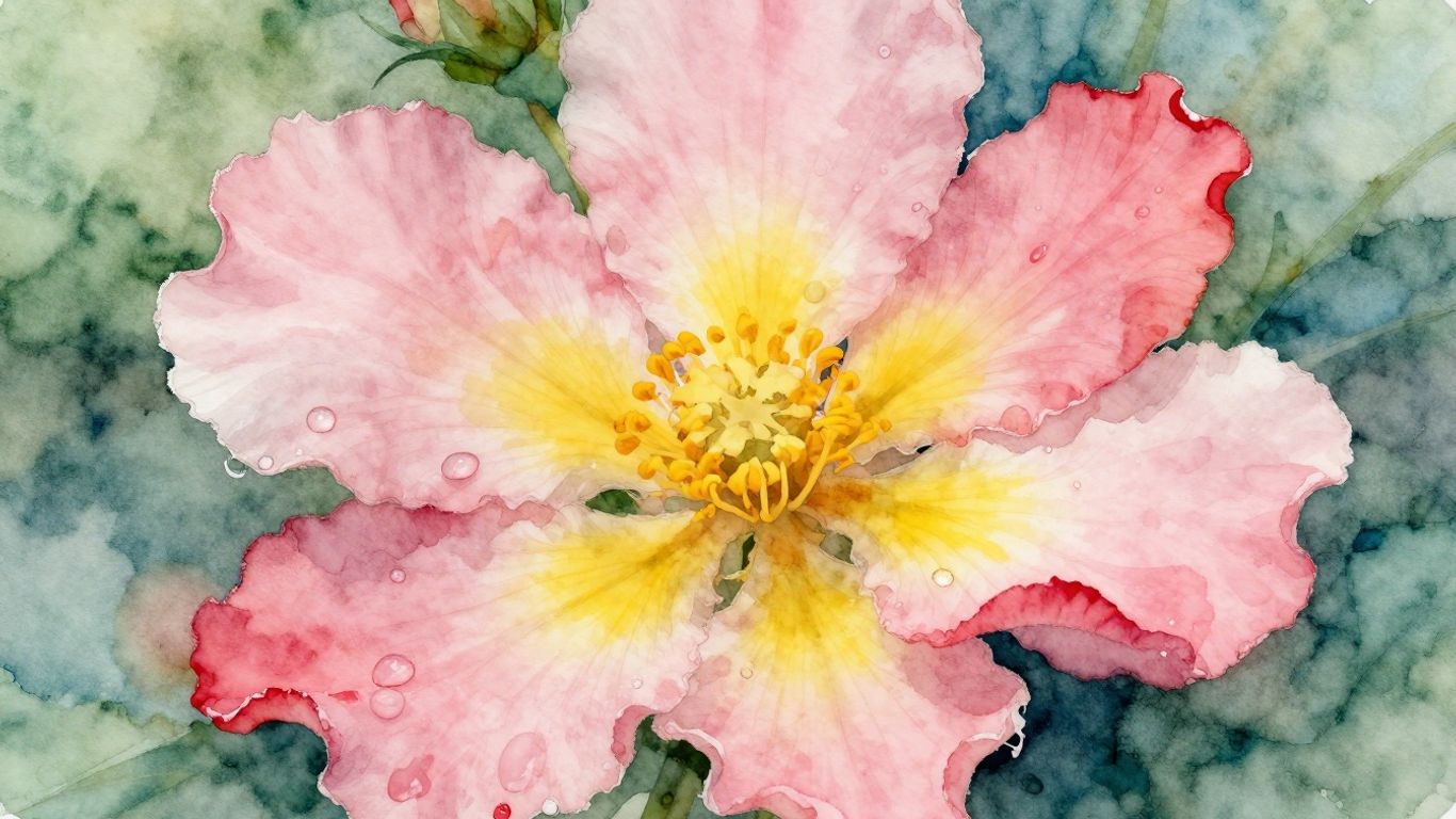
So, you want to paint flowers with watercolors, huh? It’s a really nice way to capture nature’s beauty. This guide is all about helping you get started and make your flower watercolour painting look amazing. We’ll cover some basic stuff and then move on to more detailed techniques. Don’t worry if you’re new to this; we’ll keep it simple and fun. Let’s get those brushes wet and make some pretty floral art!
Key Takeaways
- Start with good paper and paints for the best results in your flower watercolour painting.
- Learn to layer colors gradually to give your flowers depth and a lifelike feel.
- Experiment with wet-on-wet and wet-on-dry techniques to create different textures and effects.
- Color mixing is important; understand how colors work together for vibrant floral art.
- Practice adding fine details to petals and leaves to make your flower watercolour painting pop.
Essential Techniques For Flower Watercolour Painting

Getting started with watercolor flowers can feel a bit daunting, but honestly, it’s all about getting comfortable with a few core methods. Think of these as your building blocks for creating those beautiful, delicate blooms.
Mastering Layering For Depth
Layering is how you give your flowers that sense of real volume, making them pop off the page. It’s not just about slapping on more paint; it’s a thoughtful process. You start with a very light wash, almost like a whisper of color, to get the basic shape down. Then, you let that dry completely. Seriously, wait for it to dry. Once it’s dry, you add another layer, maybe a bit darker or a slightly different shade. This gradual build-up is what creates those subtle shifts in color and tone, giving the petals a rounded, realistic feel. It’s like building a cake, layer by layer, but with paint.
Exploring Wet-on-Wet And Wet-on-Dry Applications
These two techniques are like the yin and yang of watercolor. Wet-on-wet is when you put paint onto paper that’s already wet. This makes the colors spread and blend softly, creating those dreamy, atmospheric effects that are perfect for backgrounds or the soft edges of petals. It’s unpredictable in the best way. On the other hand, wet-on-dry means applying paint to dry paper or a dry layer of paint. This gives you a lot more control. You get crisp lines and defined shapes, which is great for adding details like the sharp edges of leaves or the center of a flower.
Here’s a quick rundown:
- Wet-on-Wet:
- Pre-wet your paper.
- Drop paint onto the wet surface.
- Watch colors blend softly.
- Best for soft transitions and backgrounds.
- Wet-on-Dry:
- Use dry paper or dry paint layers.
- Apply paint for sharp edges.
- Offers maximum control for details.
The Art Of Glazing For Luminous Color
Glazing is a technique where you apply thin, transparent layers of color over dried paint. It’s similar to layering, but the key here is transparency. Each layer lets the color underneath show through, creating a luminous, glowing effect. This is fantastic for building up rich, complex colors without making them look muddy. For instance, you might glaze a light yellow over a light pink to create a peachy tone, or a thin blue over a green to make a more complex, natural green. It takes patience, as each layer needs to dry, but the result is a depth and vibrancy that’s hard to achieve any other way.
Watercolor relies on transparency. Unlike opaque mediums, you’re not covering up mistakes; you’re building up color and light. This is why understanding how layers interact is so important for creating depth and luminosity in your floral paintings. Patience is definitely a virtue here.
Building Your Flower Watercolour Painting Foundation

Before you can paint those stunning florals, you need to get your supplies and basic knowledge in order. It might not sound as exciting as splashing paint around, but trust me, having the right tools and understanding how they work makes a huge difference. It’s like trying to bake a cake without flour – you’re just not going to get the result you want.
Selecting Quality Paper And Paints
This is where you don’t want to skimp. Cheap paper can buckle and tear when it gets wet, and the colors might look dull. Look for paper that’s at least 140lb (300gsm) and ideally 100% cotton. It handles water much better. For paints, you don’t need a massive set to start. A small selection of good quality tube watercolors will give you vibrant colors that are easy to re-wet and mix. Think about getting a few primaries (red, yellow, blue), a green, and maybe a brown. You can do a lot with just those. Getting your supplies sorted is the first step to making beautiful watercolor flowers.
Understanding Color Mixing And Palettes
Color mixing can feel a bit like magic, but it’s really just science and practice. Understanding the color wheel is super helpful. Knowing which colors are opposite each other (like red and green) means you can use them to neutralize each other for muted tones or shadows. Mixing colors on your palette gives you more control, but don’t be afraid to mix them directly on the paper, especially when using the wet-on-wet technique. This can create some really lovely, unexpected blends.
Here’s a quick rundown on mixing:
- Primary Colors: Red, Yellow, Blue. You can’t make these by mixing other colors.
- Secondary Colors: Green (Blue + Yellow), Orange (Red + Yellow), Violet (Red + Blue). These are made by mixing two primaries.
- Tertiary Colors: These are made by mixing a primary and a secondary color, like blue-violet or red-orange.
Don’t get too caught up in trying to get the exact color right away. Watercolors are transparent, so you can always layer more color on top to adjust it. It’s better to start lighter and build up.
Choosing The Right Brushes For Detail
Brushes are your hands in the painting world. For flowers, you’ll want a few different types. A medium-sized round brush is great for general washes and larger petals. A smaller round brush is perfect for those finer details, like the center of a flower or delicate leaf veins. Some artists also like a flat brush for broad washes or a mop brush for really big areas. The key is to have brushes that hold a good amount of water but also have a nice, sharp point for control. You’ll find that different brushes lend themselves to different techniques, so experimenting is part of the fun.
Bringing Your Flower Watercolours To Life
Okay, so you’ve got your paints, your paper, and you’ve got a general idea of what you want to paint. Now comes the fun part: making those flowers actually look like they’re blooming on the page. It’s all about how you handle the water and pigment, really.
Creating Soft Transitions With Wet Washes
This is where watercolor really shines, I think. When you want those soft, dreamy edges, like the fuzzy center of a daisy or the gentle fade of a rose petal, you want to work wet-on-wet. Basically, you wet an area of your paper first, then drop your color into that wet space. The pigment just spreads out, creating these beautiful, soft blends that are hard to get any other way. It’s great for backgrounds too, giving a nice atmospheric feel without sharp lines. You can control it a bit by how much water you use on the paper and in your brush. More water means more spread, less water means a bit more control.
Achieving Crisp Edges With Dry Brushwork
Sometimes, you need the opposite – sharp, defined lines. Think about the sturdy stem of a flower or the defined edge of a leaf. That’s where dry brush comes in. You use a brush that has very little water in it, almost dry, and drag it across the paper. This leaves little gaps in the paint, giving a textured, scratchy look that’s perfect for those sharper details. It’s also good for showing texture, like the rough bark on a branch or the delicate veins on a petal. It takes a bit of practice to get the right amount of paint and pressure, but it’s worth it for the contrast it adds.
Adding Delicate Details To Petals And Leaves
This is the final polish, the little touches that make your painting pop. Once your main washes are dry, you can go in with a fine-tipped brush and add those tiny details. This could be the subtle veins on a leaf, the tiny shadows in the folds of a petal, or even a few highlights to show where the light is hitting. These small additions are what really bring your flowers to life and give them dimension. It’s like the difference between a sketch and a finished painting. You can also use this technique to add texture, like the fuzzy bits on a succulent or the fine hairs on a stem. Don’t overdo it, though; too many details can make the painting look busy.
When you’re working on bringing your flowers to life, remember that watercolor is a forgiving medium, but it also has its own personality. Don’t be afraid to experiment with how much water you use. Sometimes, a happy accident with a wet wash can lead to a beautiful effect you wouldn’t have planned. The key is to observe your subject closely and then translate that observation using the unique properties of watercolor.
Elevating Your Flower Watercolour Artistry
So, you’ve got the basics down, you’re layering like a pro, and your colors are starting to sing. Now what? It’s time to really make those floral paintings pop. This is where we move beyond just painting flowers to creating art that has a real presence.
Composing Your Floral Subjects
Think about how you arrange your flowers on the page. It’s not just about sticking a bunch of blooms together. You want to create a visual story. Consider the rule of thirds – imagine your paper divided into nine equal squares by two horizontal and two vertical lines. Placing your main subject or points of interest along these lines or at their intersections can make your composition much more dynamic and pleasing to the eye. Also, think about the flow. Do the stems lead the viewer’s eye through the painting? Are there interesting shapes created by the negative space between the flowers?
- Balance: Distribute visual weight evenly. This doesn’t always mean symmetry; asymmetrical balance can be very effective.
- Rhythm: Create a sense of movement and flow with the arrangement of your flowers and leaves.
- Focal Point: Guide the viewer’s eye to the most important part of your painting.
- Variety: Mix different flower shapes, sizes, and textures to keep things interesting.
Designing Complementary Backgrounds
The background is just as important as the flowers themselves. It’s the stage on which your floral stars perform. A busy background can fight with your subject, making it hard to see. A plain wash might be too boring. The trick is to create a background that supports your flowers without overpowering them. Think about using softer, more muted colors for the background, or perhaps a simple wash that hints at a setting rather than defining it. Sometimes, a bit of texture in the background can add depth. You can achieve this with a dry brush technique or by lifting some paint while it’s still wet. Remember, the goal is to make your flowers the hero of the piece. You can find some great free watercolor tutorials that touch on background techniques.
A well-chosen background can make your flowers feel more grounded and real, or it can add a touch of dreaminess to your artwork. It’s all about creating the right mood.
Developing a Personal Artistic Style
This is perhaps the most exciting part. As you paint more, you’ll start to notice what you like, what techniques feel natural to you, and what subjects you’re drawn to. Don’t be afraid to experiment. Try different ways of applying paint, different color combinations, and different subjects. Maybe you love the loose, expressive style of wet-on-wet, or perhaps you prefer the precision of detailed botanical illustration. Your style is a reflection of your personality and your unique way of seeing the world. Embrace what makes your art distinctly yours. It’s a journey, not a destination, so keep painting, keep exploring, and your signature style will naturally emerge.
Advanced Flower Watercolour Painting Methods
Capturing the Texture of Petals
Getting the feel of petals right in watercolor is all about playing with your brush and paint. Think about how a rose petal feels – maybe smooth, maybe a bit velvety. For smooth petals, you’ll want to use thin washes, letting them dry completely before adding another layer. This builds up a subtle sheen. For a softer, velvety look, try using a slightly damp brush with a bit more pigment and dabbing it onto the paper. Don’t be afraid to leave some white space; it can really make the petal pop. You can also use a dry brush technique with very little water and a lot of paint to create a slightly rougher texture, like on a peony or a daisy.
Rendering Veining and Subtle Edges
This is where the magic happens for realism. For those fine veins on leaves or the delicate lines on a petal, you need a brush that can hold a fine point and a paint consistency that isn’t too watery. A rigger brush or a small round brush works well. Load it with a bit of color – maybe a slightly darker shade of the petal or leaf color – and draw those lines with a steady hand. For subtle edges, like where a petal curves, you can use a damp brush to gently lift some of the paint while it’s still wet, or carefully add a thin, darker line right at the edge to create a shadow.
Using Optical Mixing for Richness
Optical mixing is a fancy term for letting colors mix in your eye, not just on your palette. In watercolor, because the paint is transparent, you can layer colors on top of each other. So, instead of mixing a specific green for a leaf, you might paint a yellow-green wash and then layer a transparent blue over parts of it. Where the blue sits over the yellow, your eye sees green. This creates a much more vibrant and complex color than if you just mixed a flat green. It’s great for getting those deep, rich shadows or the subtle shifts in color you see in real flowers. It takes practice, but it really makes your paintings sing.
When you’re working on advanced techniques, remember that watercolor is a journey. Each flower, each petal, each leaf offers a chance to experiment. Don’t aim for perfection right away; focus on learning how the paint behaves and how different applications affect the final look. The most beautiful watercolor flowers often come from happy accidents and a willingness to try new things.
Here’s a quick look at brush choices:
| Technique | Best Brush Type |
|---|---|
| Fine Veining | Rigger or Small Round |
| Soft Textures | Damp Round Brush |
| Smooth Washes | Larger Round or Wash |
| Dry Brush Texture | Stiff Bristle Round |
Keep Painting Those Petals!
So, we’ve gone over a bunch of ways to get those flowers looking just right in watercolor. Remember, it’s all about playing around with the paint, trying out different washes, and not being afraid to layer things up. Whether you’re doing a quick sketch or a detailed piece, the main thing is to just keep practicing. You’ll find your own style and what works best for you as you go. Don’t worry if it’s not perfect every time; that’s part of the fun with watercolors. Just keep those brushes wet and those colors flowing, and you’ll be creating beautiful floral art before you know it.
Frequently Asked Questions
What are the basic things I need to start painting flowers with watercolors?
To begin painting flowers with watercolors, you’ll need good quality paper that can handle water without buckling, some basic watercolor paints in pretty colors, and a few different brushes. A round brush is great for details, and a larger flat brush can help with washes. Don’t forget a palette to mix your colors on and a jar of clean water!
How do I make my flower colors look deep and not flat?
To give your flower paintings depth, try layering your colors. Start with a light wash of color and let it dry completely. Then, add another layer of slightly darker or different color on top. This builds up the color gradually, making it look richer and more three-dimensional, like real petals.
What’s the difference between wet-on-wet and wet-on-dry watercolor techniques?
Wet-on-wet means painting with a wet brush onto wet paper. This makes colors blend softly and spread out, creating fuzzy, dreamy effects – perfect for soft backgrounds or misty petals. Wet-on-dry is painting with a wet brush onto dry paper. This gives you more control and creates sharper lines and details, like the crisp edges of leaves or petals.
How can I get smooth color changes in my flower petals?
For smooth color changes, try the ‘wet-on-wet’ technique. First, wet the area of the paper where you want the color to blend. Then, gently drop different colors onto the wet paper with your brush. Watch as they naturally swirl and mix together, creating beautiful, soft gradients that look like real flower petals.
Is it important to understand color mixing for watercolor flowers?
Yes, understanding color mixing is super helpful! Knowing how to mix colors lets you create a wide range of shades and tones for your flowers, rather than just using the colors straight from the tube. It helps you match the colors you see in nature and make your paintings look more realistic and vibrant.
How do I add the tiny details like veins on leaves or delicate edges on petals?
To add those fine details, use a small, pointed brush, often called a rigger brush. With a bit of control and a slightly thicker paint mixture, you can carefully paint thin lines for leaf veins or the delicate, lacy edges of petals. Practicing these small strokes on scrap paper will help you get the hang of it.


Leave a Reply