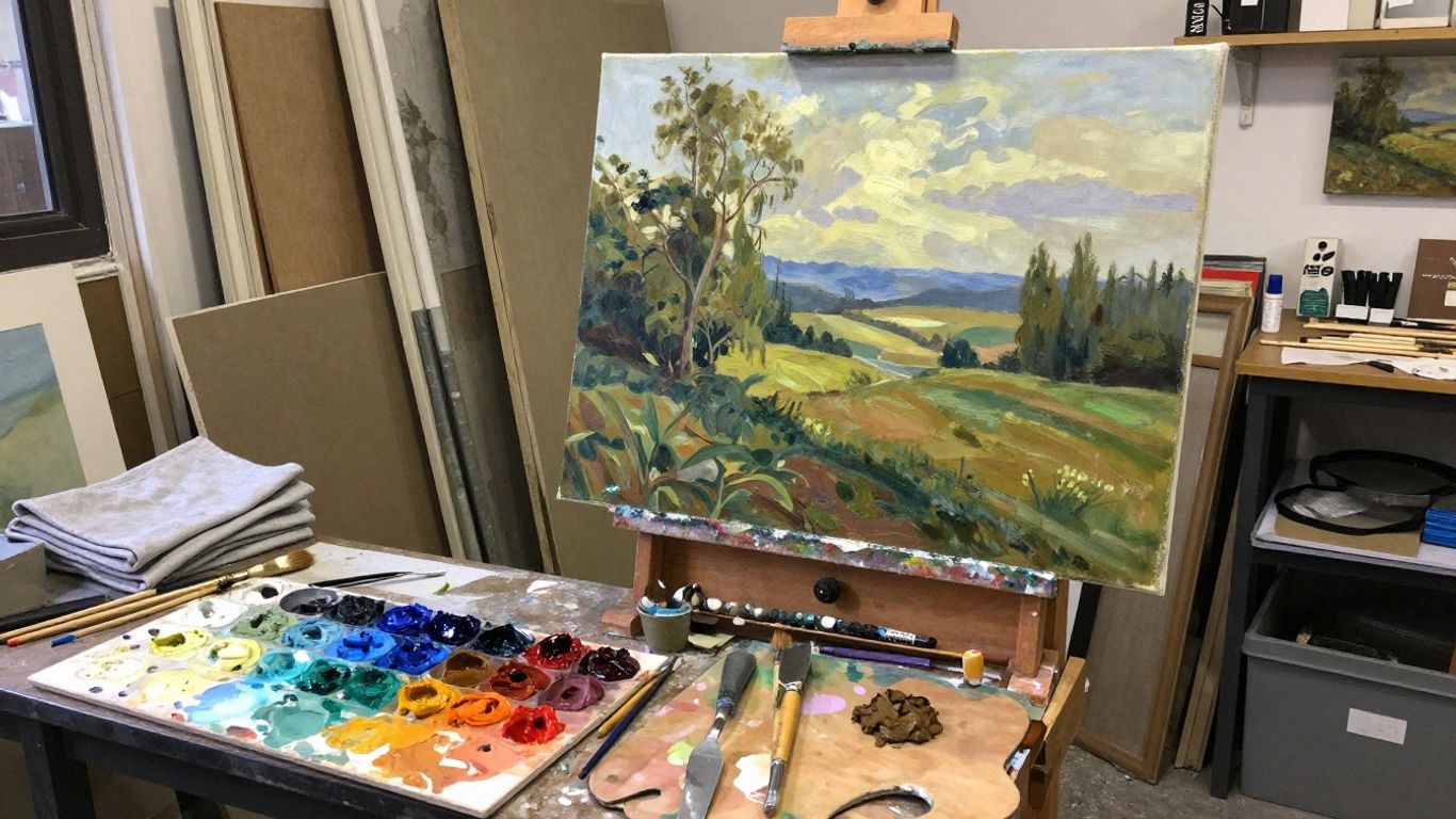
Key Takeaways
Painting oil paintings becomes less intimidating when you treat it as a sequence of manageable decisions rather than one grand performance.
- Choose materials that suit your surface, working habits, and budget.
- Begin with a small value plan before committing to details.
- Build paint in a considered order, keeping thin layers beneath richer ones.
- Judge color by its neighbors, not by the paint on the palette alone.
- Pause often so you can correct problems before the surface becomes overworked.
Choosing materials for painting oil paintings
Oil paint rewards patience, but it does not require an enormous collection of supplies. A small, dependable kit is usually more useful than a drawer full of colors and mediums. Start with materials you can understand, repeat, and replace without disrupting your process.
Essential paints, brushes, and surfaces
A beginner can work effectively with a limited palette: a warm and cool version of the primary colors, plus white and perhaps an earth color. Look for brushes in several shapes and sizes, including a flat for broad passages, a filbert for softer transitions, and a small round for accents. The surface should be firm, properly prepared, and large enough for the subject without making every mark feel precious.
Oil paint is pigment held in a drying oil, which gives it a long working time and allows color to remain rich while you adjust it. The history and material character of the medium are explored in this oil painting history, which is useful background before buying a first set of tubes.
Comparing stretched canvas, panels, and boards
Stretched canvas is light and familiar, with a gentle spring beneath the brush. Panels and boards feel more stable, making them pleasant for small studies, precise edges, and travel work. A rigid support can also make scraping and repainting easier, though it may need a backing or frame for protection later.
Think about the scale, storage, and handling your painting will require. A small panel is often ideal for studies, while a stretched canvas may suit a larger finished work. Whatever you choose, inspect the surface for dents, loose fabric, or inadequate primer before you begin.
Selecting mediums, solvents, and palette knives
Mediums change the flow, sheen, transparency, or drying behavior of paint, so introduce them one at a time. A palette knife is useful for mixing clean piles of color and for laying down broad, decisive marks. Solvent should be treated as a tool for cleaning or thinning where appropriate, not as something to add automatically to every mixture.
Keep a separate area for clean paint and mixtures that contain solvent. If you are comparing supply costs or planning a small creative workspace, this studio flooring guide offers practical considerations about surfaces, equipment, and maintenance, even though its main subject is broader studio planning.
Understanding archival and studio safety considerations
Use products labeled for artistic use, keep containers closed, and avoid eating or drinking beside an active palette. Ventilation matters whenever you use solvent, and oily rags should be stored safely rather than left in a loose pile. Read the safety information supplied with each product because drying oils, pigments, and cleaners do not all behave alike.
Good habits protect both the painting and the painter. Dispose of waste according to local rules, wash hands after working, and keep a simple inventory so you know which materials are open, aging, or no longer suitable.
Preparing your workspace and painting surface
A calm setup makes painting easier before the first mark appears. Place the easel where you can step back, keep your palette at a comfortable height, and leave enough room to view the work from several distances. The goal is not a perfect studio but a repeatable arrangement that reduces interruptions.

Setting up lighting and ventilation
Use a consistent light source so colors do not shift dramatically from hour to hour. Neutral, indirect daylight can be helpful, while a controllable artificial light makes evening work more predictable. Position illumination to avoid glare on wet passages, and maintain ventilation whenever solvent is present.
A fan should move air without blowing dust directly onto the painting. Keep windows, doors, and work surfaces easy to access so the room can be cleaned rather than gradually becoming part of the paint process.
Toning and priming the surface
A white ground can make early mixtures appear darker than they really are, while a muted tone can provide a middle value from the beginning. Apply a tone thinly and let the surface become suitably dry before drawing. If the support needs priming, follow the product instructions and allow adequate drying between coats.
A toned ground should remain visible in small gaps, not dominate the painting. Choose a color that belongs to the subject’s general atmosphere, such as a warm neutral for a sunlit still life or a cooler gray for a restrained landscape.
Organizing a practical palette
Arrange colors in a consistent order around the edge of the palette, leaving the center open for mixtures. Put white where it will not be contaminated by dark or complementary colors. A modest palette encourages you to learn how colors behave together instead of chasing every local color with a new tube.
When several decisions compete for attention, a simple work order helps:
- Mix the largest light and dark families first.
- Reserve clean piles for important accents.
- Wipe the mixing area between unrelated color groups.
- Keep a small note of unusual mixtures you may need again.
After this kind of organization, the palette becomes a map rather than a crowded tray. You can spend more attention on relationships in the subject and less on searching for a clean place to mix.
Planning proportions and reference images
Before enlarging a sketch, compare the width and height of the subject with the support. Mark a few anchor points, such as the top of a head, the edge of a table, or the horizon. Reference images are helpful, but they should support observation rather than replace it; check the source against the actual structure you want to paint.
For digital reference management, keep images at a useful size and avoid constantly switching between unrelated views. A landscape painting guide can also help when a scene depends on simplified shapes, changing light, and atmospheric depth.
Building an oil painting from the first sketch
A painting usually becomes clearer when its large decisions are made before its small ones. The first drawing does not need to be beautiful; it needs to establish placement, proportion, and direction. Work from general masses toward specific information, checking the whole image repeatedly.
Creating a thumbnail and value study
Make several tiny sketches using only a few tones. Try changing the crop, the horizon, or the dominant light-dark arrangement before choosing a final composition. A value study reveals whether the subject will read from across a room, which is more valuable at this stage than a detailed likeness.
Squinting at the reference can simplify distracting information. If the main shape disappears when you squint, the composition may need stronger grouping before you proceed.
Blocking in major shapes and colors
Use a thin mixture to place the main shapes and broad color families. Ignore eyelashes, leaves, hardware, and other small features until the large masses sit convincingly. Step back often; early changes are cheap, while late changes can disturb several finished passages.
The first pass should feel provisional. Its purpose is to test the drawing, proportion, and temperature of the image, not to establish the final surface quality.
Establishing accurate values and edges
Value describes how light or dark a passage appears, while an edge describes how quickly one shape changes into another. Compare neighboring areas rather than judging each patch in isolation. Lost edges can make forms recede, while sharper edges can bring attention forward.
Before adding detail, ask whether the lightest light and darkest dark are in the right places. Clear value relationships usually make a painting feel more convincing even when the drawing remains economical.
Developing forms through layered painting
Build form by placing related passages beside one another and adjusting them as a group. A cheek, ceramic bowl, or folded cloth should not be modeled with a single strip of shading; it needs planes, transitions, and reflected color that belong to the surrounding environment.
Let each layer serve a purpose. One pass may establish structure, another may clarify temperature, and a later one may reserve a few accents. If every layer tries to solve everything, the surface can become busy without becoming more accurate.
Using essential oil painting techniques
Oil paint can be pushed, softened, scraped, thinned, or left visibly textured. The best technique depends on the passage and the stage of the painting, not on a desire to display every method in one image. Learn what each approach does to edges, transparency, and surface rhythm.

Fat-over-lean and why drying time matters
“Fat” refers to paint containing more oil, while “lean” describes a layer with less oil, often because it has been thinned. The traditional fat-over-lean principle places leaner, faster-drying layers beneath richer, more flexible ones. This helps reduce structural problems as the paint continues to dry and cure.
The Anna Bregman Portraits guide explains this relationship between oil content, drying time, and flexibility. In practice, avoid piling a heavily oil-rich layer beneath a lean upper layer, and give each passage time to settle before making a major change.
Blending, scumbling, and glazing
Blending softens a transition by moving wet paint across a boundary, but it is easy to erase useful structure through excessive brushing. Scumbling uses a relatively dry, broken application so some of the layer beneath remains visible. Glazing places a transparent color over a dry passage, shifting its appearance without covering every detail.
Use these techniques selectively. A soft transition belongs where the form turns gradually, while a broken or transparent mark can add air, light, and variation to a surface that would otherwise look uniformly smooth.
Impasto and controlled brushwork
Impasto leaves paint sitting above the surface, giving a stroke physical presence. It works well for selected highlights, thick foliage, textured fabric, or expressive focal marks. Controlled brushwork does not mean every stroke must be hidden; it means each stroke has a reason and does not compete with the entire painting.
Mix enough paint before beginning a textured passage. A hesitant, underloaded brush often produces a weak ridge that must be repainted, while a confident loaded stroke can remain intact.
Wet-on-wet versus layered methods
Wet-on-wet painting keeps passages open so colors can be adjusted directly on the surface. It is useful for changing skies, broad atmospheric effects, and quick studies, but it demands attention because neighboring mixtures can become dull. Layered painting offers more control over transparency, edges, and drying, though it requires waiting.
Neither approach is a rule for every painting. Many artists combine them: a carefully planned underpainting, wet adjustments in broad areas, and dry layered accents where clarity matters most.
Mixing color and creating visual depth
Color becomes easier to manage when you separate what you see into hue, value, and saturation. A red object may be lighter on one plane, duller in shadow, and cooler near a reflected surface. Treating these changes as relationships keeps mixtures lively and prevents the painting from becoming a collection of isolated swatches.
Understanding hue, value, and saturation
Hue is the family name of a color, value is its lightness or darkness, and saturation is its intensity. A mixture can match the hue but fail in value, or match the value while being too vivid. Check all three, especially when a passage seems close but still feels wrong.
A grayscale photograph or a brief squint can help diagnose value. For color, compare the mixture directly with the reference and with the paint already surrounding it.
Mixing neutrals without muddying colors
Neutrals are often mixtures with reduced intensity rather than lifeless gray. Introduce a complement in small amounts, or combine an earth color with a brighter neighbor until the mixture loses some force. Keep mixtures clean by using a partly clean brush and by knowing which pigments have strong tinting power.
Mixing on the palette and mixing optically on the surface produce different effects. Small adjacent strokes can retain more life than a single thoroughly blended pile, particularly in light or reflective areas.
Using warm and cool color relationships
Warm and cool shifts can describe light, depth, and material without requiring dramatic changes in hue. A warm light may sit beside a cooler shadow, or a distant object may become cooler and less saturated as it recedes. These relationships should be observed rather than applied mechanically.
If every light is warm and every shadow is cool, the result may feel formulaic. Look for exceptions: reflected sunlight, colored walls, nearby fabrics, and the local color of the object can all modify the temperature.
Creating atmospheric perspective
Atmospheric perspective is created through changes in value, saturation, edge softness, and temperature. Distant forms generally lose contrast and detail, while nearer forms can hold sharper edges and stronger color. Even in a small interior, similar ideas apply when one object sits behind another.
A focused subject benefits from selective clarity. The SMS copywriting resource is unrelated in subject but offers a useful reminder about clear, economical communication: in a painting, too, not every area needs equal emphasis. Keep the strongest contrasts where you want the eye to pause.
Solving common problems and improving your process
Most difficult passages are not signs that a painting has failed. They are information about what needs to change: a value may be too close to its neighbor, an edge may be too sharp, or the surface may have received too many uncertain strokes. Diagnose the specific problem before reaching for more paint.
Correcting muddy or overworked passages
When a mixture becomes dull, stop scrubbing and remove only what must go. Wipe or scrape the passage carefully, allow it to become stable if necessary, and repaint with a simpler mixture. Preserve a few earlier marks when they still support the form; correction does not require erasing the entire history of the area.
Muddiness often comes from mixing too many unrelated colors together or repeatedly dragging a brush across a wet boundary. Clean tools and fewer deliberate strokes usually help more than adding another bright pigment.
Managing cracks, sinking color, and uneven drying
Cracks can result from unsuitable layer relationships, a weak support, movement, or improper drying conditions. Sinking color describes a passage that appears duller or less glossy as oil is absorbed into a lower layer. Uneven drying can make comparisons difficult because some areas look finished while others remain glossy.
Work on a properly prepared support and avoid rushing incompatible layers. If a finished work develops a serious structural issue, consult a conservator rather than attempting an aggressive home repair.
Knowing when to stop a painting
Stop when the next change is likely to solve a clear problem rather than relieve anxiety. Put the painting aside, view it in a mirror or photograph, and return after a break. If the composition, values, and main edges still hold together, additional detail may only reduce its freshness.
A useful stopping test is to identify the three passages that matter most. If they communicate the subject and the rest supports them, the painting may already be doing its job.
Cleaning tools and preserving finished work
Wipe excess paint from brushes before using the appropriate cleaner, then reshape the bristles and let them dry in a way that protects their form. Keep palette knives clean so old mixtures do not contaminate new ones. Store wet paintings where dust, pets, and accidental contact cannot reach them.
Once a painting is dry enough for its intended finish, protect it from extreme heat, damp, direct sun, and careless handling. If you sell or ship work, document the materials and let the recipient know how it should be stored. For broader planning around online selling, the Amazon seller guide covers account, listing, and fulfillment considerations; those logistics are separate from the painting process itself.
Conclusion
Painting oil paintings is a patient conversation between observation, material, and revision. Begin with a clear value plan, use a modest set of supplies, build layers thoughtfully, and let each mark earn its place. With time, technical choices become less distracting, leaving more room for the particular light, texture, and feeling that make a painting yours.
Frequently Asked Questions
What is the best oil paint palette for a beginner?
A limited palette with warm and cool primaries, white, and one or two earth colors is enough to learn mixing, value, and temperature without creating unnecessary clutter.
Should I start with canvas or a panel?
Either can work. Canvas is light and familiar, while a rigid panel offers stability for small studies and precise passages. Choose the support that feels easiest to prepare and store.
How long should an oil painting dry between layers?
Drying time varies with pigment, thickness, medium, temperature, humidity, and airflow. Judge the surface by touch and appearance, and follow the product guidance rather than relying on a fixed number of hours.
What does fat-over-lean mean?
It means placing leaner, less oil-rich layers beneath richer, more flexible layers. The principle helps reduce cracking and other problems caused by uneven drying and movement.
Why do my colors look muddy?
Muddy color often comes from overmixing, using a dirty brush, or repeatedly dragging wet mixtures across one another. Simplify the mixture, clean the tool, and compare the passage with its neighbors.
Is solvent required for oil painting?
No. Some artists use solvent for thinning or cleaning, while others choose solvent-free materials and methods. Follow the safety instructions for whatever products you use and maintain good ventilation.
When should I varnish an oil painting?
Varnishing should wait until the paint has sufficiently dried and cured for the chosen product. Follow the manufacturer’s instructions, and seek professional advice for valuable or fragile work.


Leave a Reply