Key Takeaways
Curating wall pieces for your sleeping space creates a sanctuary that feels both personal and polished. By understanding scale, color cohesion, and placement, you can transform any blank surface into a deliberate design statement.
- Define your personal style through mood boarding and medium testing.
- Focus on central focal points like headboards to anchor the room.
- Use the rule of thirds or grid spacing for balanced arrangement.
- Consider material durability when selecting frames or canvases.
- Incorporate personal photography or DIY crafts for budget-friendly impact.
Determining your personal art style
Finding the right art starts with an inward look at what truly resonates with your inner sensibilities. Your bedroom acts as a quiet haven where external trends hold less weight than your own internal peace. Start by assessing what shapes, tones, and subjects invite a sense of calm or inspiration into your daily life.
Identifying your aesthetic preferences
Begin by browsing different portfolios to see which visual languages speak to you most clearly. Whether you gravitate toward minimalism or detailed illustrative work, the most satisfying choices are those that reflect your genuine personality rather than what appears popular in magazines. Consider bedroom wall art as an extension of your own narrative.
Balancing taste with room functionality
While your personal style leads the way, the room’s primary use—rest and rejuvenation—must remain at the forefront. Soft, soothing palettes generally provide a better backdrop for sleep than highly stimulating or aggressive colors. You might feel drawn to the elegant bedroom art that focuses on fluid lines and organic shapes to minimize visual noise.
Using inspirational imagery for mood boards
If you find yourself stuck, gather digital or physical snapshots that evoke the specific mood you want to inhabit. A quick collage helps clarify whether you prefer a cohesive theme or an array of eclectic interests. Bedroom wall decor ideas often surface when you stop looking for the perfect piece and start identifying your collective visual history.
Selecting mediums for different moods
Different artistic mediums carry unique textures that drastically alter how a space feels to the touch and the eye. Stretched canvas often provides a soft warmth, while framed photography can offer sharp, clear focus for a more modern appearance. Choosing the right medium is the secret ingredient to depth in your room design.
Where to place wall art for the best effect

Positioning is often the difference between a messy wall and a curated display. A common mistake is hanging pieces too high, creating a visual disconnect between the objects and your furniture. Think of every blank wall as an opportunity to bridge the gap between your physical furniture and the surrounding architecture.
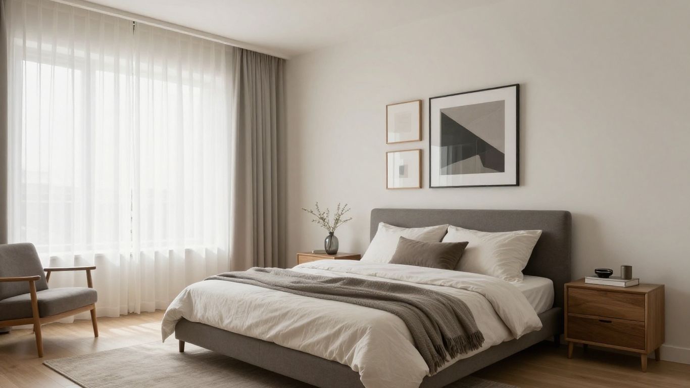
Positioning art above the headboard
Your headboard serves as the room’s main anchor, making the wall space above it the most logical home for a primary piece. Keep the scale large enough to feel intentional, yet leave a few inches of clearance so the work doesn’t sit flush against the top of the bed. If you need help with installation, professional resources like FWD Movers can offer guidance on handling delicate decor during room refreshes.
Utilizing space on secondary focal walls
Once the area above the bed is set, look to the wall you face upon waking up. This is a primary focal point that should feature something that sets a positive tone for your morning. Avoid overcrowding this space with too many small items, as a single, striking piece often does more to elevate a room.
Incorporating art in reading or seating nooks
If you have a dedicated corner with a chair or bench, this becomes a secondary zone for more intimate art choices. Smaller prints or a mini gallery wall can make a seating area feel like a private library or a cozy escape. Make sure the lighting here allows for close-up enjoyment of finer details.
Considering eye level for optimal viewing
Standard gallery heights suggest centering art roughly at eye level, which is usually about 57 to 60 inches from the center of the piece to the floor. While this is a guideline, adjustments may be necessary if you spend most of your time in the room sitting in bed or at a desk. Keep comfort in mind more than strict numerical rules when placing your work.
Choosing the right size and scale for your space
Scale changes the entire perspective of a room, often serving as the deciding factor in how large or cramped a bedroom feels. Choosing art that is too small can make it disappear into the wall, whereas oversized pieces can overwhelm finer furniture. Keeping a balanced proportion between your artwork and the nearest piece of furniture is a great interior design standard.
Understanding the rule of thirds in wall decor
Divide your wall space into three conceptual parts, both horizontally and vertically, to find the intersection where art will hold the most visual weight. This classical approach ensures your wall art works with the architecture rather than against it. Using this method effectively draws the eye toward the most interesting parts of your room.
Matching frame sizes to furniture dimensions
Aligning the width of your art with the width of the headboard or dresser creates a sense of geometric stability. A piece that extends roughly two-thirds the width of the furniture below it tends to feel grounded and proportionate. It prevents the room transition from feeling jagged or disconnected.
Grouping smaller pieces to fill voids
When a single piece feels insufficient for a large wall, grouping smaller works allows you to fill the space without sacrificing aesthetic quality. This technique effectively turns disparate items into one coherent visual event that commands attention. Many users discover that royalty-free wall art collections on digital platforms offer a great variety of prints for these groupings.
Avoiding visual clutter in small bedrooms
In smaller rooms, less is often more to prevent the walls from closing in on you. One central, bold piece is usually better than a collection that breaks up the wall into too many small, distracting sections. Keep the surrounding decor airy so that the art remains a highlight rather than a source of chaos.
Matching your art to the color palette

Integrating art into your existing color scheme requires a careful look at the undertones of your textiles and paint. Many people use art to tie together colors present in their bedding or rug, which creates a seamless look. The following table provides a breakdown of how common color strategies affect overall room energy:
| Strategy | Primary Goal | Recommended Placement |
|---|---|---|
| Monochromatic | Soft serenity | Behind bed headboard |
| Complementary | High energy | Reading nook wall |
| Neutral Tones | Elevated calm | Above dresser units |
Complementing existing bedding and textiles
When you select pieces that mirror the colors of your sheets, toss pillows, or curtains, it creates a custom-designed feel. You do not need to match every color exactly; rather, look for shared undertones that bring harmony to the collection. A cohesive environment feels more relaxing to the nervous system.
Using art as a pop of accent color
If your room relies on a neutral gray or beige palette, a single piece of wall art featuring a vibrant accent can function as the room’s main feature. This allows you to introduce color without the long-term commitment of painting walls or replacing large furniture. It keeps your space feeling fresh and adaptable to seasonal changes.
Coordinating with metal finishes and hardware
Don’t forget that the hardware on your wardrobe, lamps, or curtain rods interacts with your framing materials. If your room features black matte hardware, pairing it with dark-framed art creates a subtle, tied-together look. Consistency in these tiny details pays off in the overall professional polish of the final space.
Deciding between monochromatic or vibrant themes
Monochromatic themes are perfect for those who want their bedroom to feel like a high-end, quiet retreat. Vibrant, high-contrast themes, however, showcase a more playful personality and provide a punchy contrast that keeps the space lively. You can also explore how to promote your presence by selecting art that genuinely reflects your professional or personal brand.
Framing and finishing considerations
Final finishes are not just about aesthetics; they protect your investment and can alter the style of a piece significantly. From raw, organic wooden frames to sleek, industrial metal options, a frame acts as a border between the artwork and the world. Choosing a finish that aligns with your room’s durability needs is essential for longevity.
Selecting frame material for durability
For a permanent bedroom setup, choose high-quality wood or metal frames that won’t warp in varied humidity levels. If you live in an area prone to moisture, keep an eye on your wall integrity as described in mold prevention checklists. Proper ventilation and air movement around your frames keep both the art and the wall in good condition for years.
The importance of matting for art prints
Matting creates a buffer between the glass and the print, preventing the image from sticking or degrading over time. A wide mat board lends a gallery-quality feel to simple prints, allowing the eye to rest within the empty space around the image. It is a simple upgrade that elevates the professional look of even everyday prints.
Choosing between glass, plexiglass, or unframed canvases
- Glass offers brilliant clarity and is resistant to scuffing.
- Plexiglass is lightweight and safer for high-traffic areas or places with children.
- Unframed canvas exudes a more relaxed, bohemian atmosphere for casual rooms.
Protecting art from direct sunlight
UV rays eventually cause fading in almost all printed mediums, so avoid hanging delicate works directly across from a sunny window when possible. If you must use a sun-drenched wall, consider using specialized UV-coated protective glass or acrylic. This simple step ensures that your favorite pieces retain their depth and saturation for the long run.
Creating a cohesive gallery wall
Gallery walls are an excellent way to capture a variety of interests, but they require significant pre-planning to avoid feeling haphazard. A successful grouping feels intentional, with each piece playing a role in a larger visual harmony. To help you structure this, consider your wall the canvas for a larger story you want to tell through your collection.
Planning the layout before installing hardware
Lay all your frames out on the floor first, shifting them until the spacing and balance feel right before you pick up a hammer. This step prevents unnecessary wall patching and allows you to test different rotations and height variations. You might consider using masking tape to outline where your frames should go, providing a clear visual reference as you work.
Mixing and matching various print styles
Variety adds interest, so don’t be afraid to mix line drawings with abstract paint strokes or photography. The key is to tether these different styles through a shared frame color or a consistent color palette within the images. This provides the variation that keeps the eye moving without inducing visual fatigue.
Balancing symmetrical versus eclectic arrangements
Symmetrical layouts provide order, making them best for formal or minimalist bedrooms where peace is the priority. Eclectic arrangements are perfect for those with a wider collection and a desire for a more relaxed, curated feel. Regardless of which you choose, the physical spacing should be kept relatively tight to make it look like a single unit.
Maintaining consistent spacing between frames
Consistent gaps—around two inches between smaller frames—make a chaotic collection look like a deliberate arrangement. If your frames have different sizes, alignment along a single centered horizontal line helps maintain order. A clean, uniform gap is the hallmark of a professional-looking gallery wall.
Budget-friendly DIY wall art alternatives
Not every impressive wall treatment requires a massive investment; often, your own creativity results in the most significant impact. By sourcing your own images or repurposing textiles, you create something no one else has. These alternatives allow you to change your style as often as you like for a minimum cost.
Utilizing personal photography for custom prints
Turning your own high-resolution travel photos into large-scale prints is a fantastic way to personalize your walls. Simply find a local printing service, choose a medium that fits your room’s vibe, and frame them in bulk frames for a unified look. It keeps the room grounded in your actual experiences rather than generic imagery.
Repurposing textiles as wall hangings
Vintage scarves, woven blankets, or tapestry remnants can act as soft pieces of wall art. These textiles bring necessary softness to a room filled with hard corners or metal accents. They are also incredibly easy to swap out when you want to shift the color scheme of your bedroom.
Creating abstract designs with paint and canvas
The most rewarding art is often the art you make yourself, and abstract painting is highly forgiving and accessible. With just two or three shades that match your existing furniture, you can create a piece that perfectly fits the proportions of your wall. Focus on texture and bold application rather than representation, and you will find it nearly impossible to fail.
Sourcing printable downloads from digital archives
Many museums and archives now release royalty-free, high-resolution vintage images that you can format and print at home. This allows you to own high-end prints without the typical price tag of an original artwork. By integrating modern design with these digital treasures, you can build a customized wall that feels both storied and fresh.
Conclusion
Styling your own space is a journey that evolves as your tastes shift and your room requirements change over time. By combining intentional placement with elements that reflect your personality, you turn a standard bedroom into a deeply personal sanctuary. Don’t be afraid to swap out pieces, experiment with new frames, or rearrange your gallery boards until the layout feels like a natural extension of yourself.
Frequently Asked Questions
Does hanging art incorrectly damage walls?
Using the wrong types of hardware or adhesive can certainly peel paint or leave unsightly divots. Always test wall treatments in a hidden area and use appropriate anchors for heavy frames to maintain structural integrity.
Should all frames in a room match perfectly?
Matching frames creates a formal feel, but intermingling textures like wood and metal can add warmth. Aim for a balance by keeping frame colors within the same tone spectrum to ensure a cohesive look.
How often should I change my artwork?
There is no strict rule for updating, though changing art seasonally can refresh the room’s energy. Feel free to rotate pieces when you notice you are no longer finding inspiration in your current selection.
Can I hang art in humid bedrooms?
If a bedroom has an ensuite bathroom, humidity may affect artwork over time. Use glass or protective acrylic, and ensure there is proper ventilation to prevent moisture from building up behind the frame.
How can I make a room feel larger with art?
Oversized, mirror-like, or light-colored artwork can open up your perception of space. Avoiding overcrowded gallery walls also helps a small bedroom feel significantly less cluttered and more serene.
Is it okay to lean art against the wall?
Leaning art offers a casual, modern aesthetic that is very flexible for renters or those who prefer avoiding wall damage. Ensure the piece is large enough to stand securely and won’t easily slide out of place.
How do I light my bedroom wall art?
Subtle, warm-toned accent lighting like picture lights or LED strips can turn an art wall into a nocturnal centerpiece. For the best effect, avoid harsh, cold light sources that change the color profile of the art.


Leave a Reply