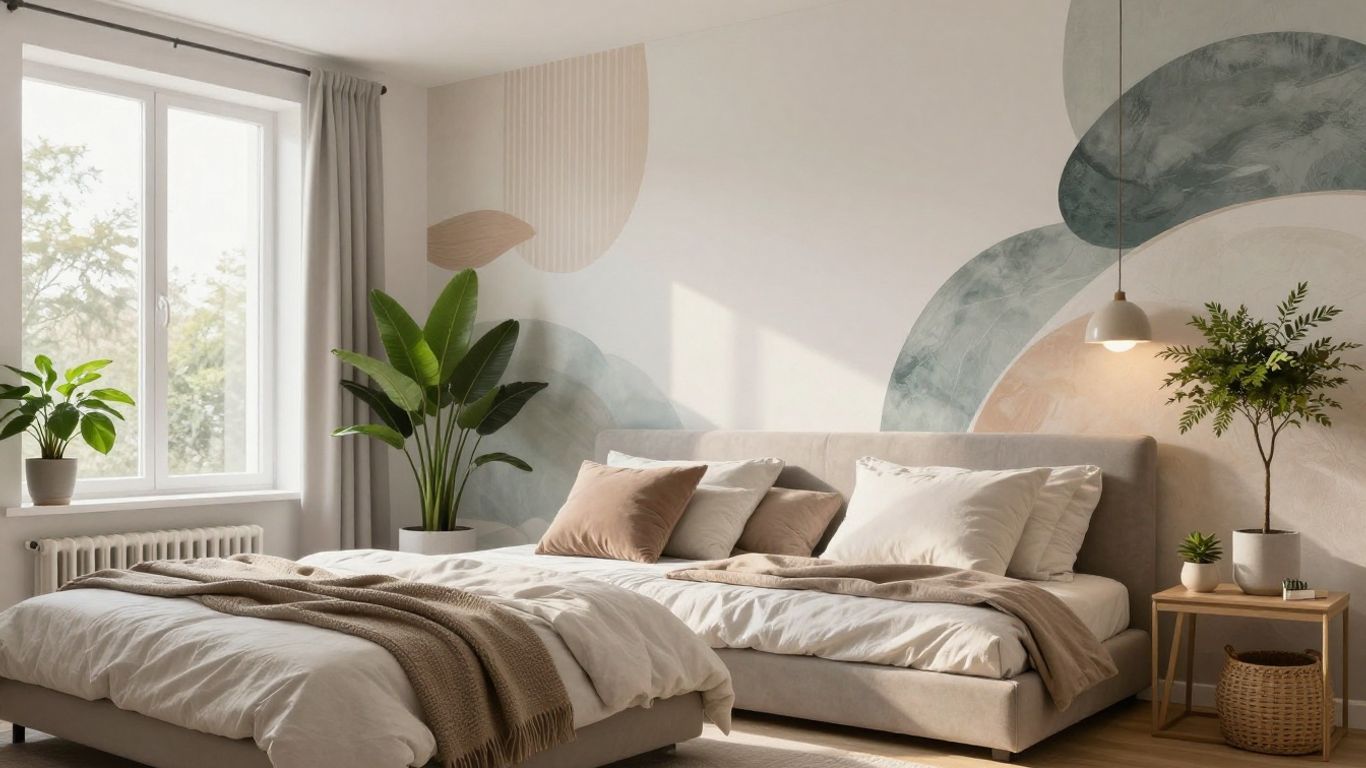
Thinking about changing up your bedroom? Sometimes all it takes is a new wall color to make the space feel brand new. The right wall painting design for bedroom can set the mood, bring in warmth, or make things feel calm and restful. In 2026, it’s not just about picking a color you like – it’s about creating a space that feels good to be in, whether you want something bold, cozy, or totally chill. Here are some fresh ideas to help you figure out what might work best for your bedroom walls.
Key Takeaways
- Earthy tones like soft clay, terracotta, and blush will make bedrooms feel warm and welcoming.
- Muted greens, especially sage and olive, are popular for creating a peaceful, nature-inspired vibe.
- Deep blues, such as navy and smoky blue, add a sense of calm and can make a bedroom feel more relaxing.
- Pinks aren’t just for kids’ rooms – delicate pinks, mauve, and plaster shades bring softness and comfort.
- Textured neutrals and bold accent colors (like emerald or burgundy) are trending for those who want something a bit different or expressive.
Embrace Warmth With Earthy Tones
Forget those stark, cool colors for a moment. In 2026, bedroom design is really leaning into the cozy embrace of earthy tones. These shades bring a grounded, natural feel to your personal sanctuary, making it feel more like a retreat than just a room. The goal is to create a space that feels both comforting and deeply personal.
The Allure of Soft Clay Hues
Think about the subtle beauty of natural clay. These colors, like a soft, muted terracotta or a warm, sandy beige, create a backdrop that’s incredibly soothing. They have a way of making a room feel instantly more intimate and welcoming. It’s not about being loud; it’s about a gentle, enveloping warmth. You can pair these hues with natural materials like wood or linen to really amplify that organic feel. It’s a simple way to bring a bit of the outdoors in, creating a calm atmosphere perfect for unwinding after a long day. This approach is a big part of the bedroom paint trends for 2026.
Dusty Rose for a Romantic Ambiance
Dusty rose is more than just a pretty color; it’s a mood. It offers a soft, romantic vibe without being overly sweet. Imagine walls painted in a muted rose, paired with cream bedding and perhaps some brushed brass accents. It creates a space that feels both elegant and inviting. This shade works particularly well because it has a certain depth to it, avoiding the flatness that some lighter pinks can have. It’s a sophisticated choice that adds a touch of warmth and personality.
Terracotta and Blush Layering
This combination is all about creating a rich, layered look that feels both artistic and comforting. Picture walls in a warm terracotta, complemented by bedding in soft blush or peach tones. The key here is to play with textures. Mixing different materials like velvet, linen, and matte paint finishes within the same color family adds dimension and keeps the look from feeling monotonous. It’s like creating a tonal masterpiece right in your bedroom, a space that feels curated and deeply personal, evoking the cozy feeling of autumn all year round.
Discover Serenity in Muted Greens

Sometimes you just want your bedroom to feel like a quiet escape, right? Muted greens are perfect for that. They bring in a bit of nature without being too bright or demanding. Think of the calm you feel walking through a forest or a peaceful garden – that’s the vibe these colors bring.
Sage Green for Natural Calm
Sage green is a really gentle shade. It’s not too dark, not too light, and it just feels… peaceful. It’s like wrapping your room in a soft, natural hug. Pairing sage walls with bedding in the same color family, maybe with some lighter accents, makes the whole room feel cohesive and super relaxing. Adding touches of brass or warm wood can really make the green pop in a subtle way, giving it a bit of polish.
Olive Green Sanctuary
If you want something a little deeper, olive green is a great choice. It can make your bedroom feel like a cozy, private retreat. Imagine walls in a rich olive, paired with natural wood furniture and maybe some botanical prints. It creates this immersive, calming effect, almost like being in a quiet grove. It works well year-round, feeling fresh in the spring and cozy in the fall.
Gray-Greens for Sophisticated Neutrals
Gray-greens are interesting because they’re not quite gray and not quite green. They offer a really sophisticated neutral that’s warmer than a plain gray. These shades bring a sense of calm and wellness, which is exactly what you want in a bedroom. They pair beautifully with natural materials like wood and linen, and adding different textures can give the room a layered, inviting feel without being overwhelming.
When choosing muted greens, think about the undertones. Some lean more yellow, others more blue. Pick the one that feels most calming to you. It’s all about creating a personal sanctuary.
Here’s a quick look at how these greens can work:
- Sage Green: Best for a light, airy feel. Pairs well with brass, light wood, and white accents.
- Olive Green: Creates a deeper, more grounded atmosphere. Works with darker woods, botanical prints, and earthy tones.
- Gray-Green: Offers a modern, sophisticated neutral. Complements natural textiles, warm metals, and cream or beige.
These colors are great because they’re versatile. You can go monochrome for a really serene look, or mix them with other soft colors and textures to add depth and personality.
Dive Into Deep and Moody Blues
Smoky Blues for Timeless Depth
Forget bright, cheerful blues for a moment. We’re talking about the kind of blues that feel like a deep twilight sky or a calm, vast ocean. These shades bring a sophisticated, almost mysterious vibe to a bedroom, making it feel like a true escape. Think of colors that have a bit of gray or green mixed in – they feel more natural and less like a primary color. These complex blues create a mood that’s both calming and incredibly chic. They work especially well in rooms where you want to feel completely relaxed and a little bit cocooned.
- Benjamin Moore’s Everard Blue: A great example of a blue-green that feels grounded and natural.
- Farrow & Ball’s Parma Gray: A softer, more muted option that still carries depth.
- Sherwin-Williams’ Naval: A darker, more intense blue that can feel almost black in certain lights.
When using these deeper blues, it’s smart to balance them. Adding lighter blues as accents, maybe in your bedding or throw pillows, can keep the space from feeling too heavy. It’s all about creating layers of color.
Navy and Soft Grey Combinations
Navy and soft grey are a classic pairing for a reason. It’s a combination that feels both strong and gentle, offering a sense of stability without being boring. Imagine navy walls paired with a soft grey sofa or bedding. It’s a look that’s been popular for a while, and it’s not going anywhere. This pairing works well because the navy provides a solid anchor, while the grey keeps things feeling light and airy. It’s a balanced approach that feels very grown-up and put-together.
| Element | Color Suggestion |
|---|---|
| Walls | Navy Blue |
| Bedding | Soft Grey |
| Accent Pillows | Lighter Blue or White |
| Furniture | Natural Wood or Black |
This combination is really versatile. You can go with a very dark, almost black navy, or a slightly softer, more muted navy. The grey can range from a light, almost white shade to a deeper charcoal. The key is to find a balance that feels right for your space and your personal style. It’s a look that can be dressed up or down depending on your accessories.
Powder Blue for a Touch of Color
Sometimes, you want that blue feeling, but you don’t want it to be too intense. That’s where powder blue comes in. It’s a lighter, softer shade of blue that still brings a sense of calm but with a bit more playfulness. Think of a chalky, matte finish on the walls. It’s a color that feels fresh and inviting, like a clear spring sky. It’s a great way to add a pop of color without overwhelming the room, making it feel bright and cheerful.
Powder blue is a fantastic choice when you want a color that feels both calming and a little bit cheerful. It’s light enough to make a room feel bigger and brighter, but it still has that cool, soothing quality that makes blue so popular for bedrooms. It’s a color that works well with natural materials like rattan and light wood, giving your space a relaxed, airy feel.
- Pair with white: Crisp white bedding and trim make powder blue walls really pop.
- Add natural textures: Rattan furniture, linen curtains, and wooden accents bring warmth.
- Incorporate subtle patterns: A floral pillow or a striped rug can add interest without being too much.
- Use metallic accents: Brushed brass or silver can add a touch of sophistication.
Explore the Nuances of Pink Palettes
Pink doesn’t have to mean bubblegum or overly sweet. For 2026, we’re seeing a sophisticated shift in how pink is used in bedroom design. It’s moving beyond the traditionally feminine and embracing a more complex, nuanced character. Think less ‘little girl’s room’ and more ‘chic adult sanctuary.’
Delicate Pinks for Softness
Soft, muted pinks are making a big statement. These aren’t the bright, attention-grabbing shades, but rather gentle hues that create a calming atmosphere. Imagine walls painted in a shade like Farrow & Ball’s Setting Plaster, which designer Mary Beth Sullivan notes can even lean masculine due to its subtle warmth. It’s a comforting color that brightens a room without being overwhelming. Pairing these soft pinks with base neutrals like oatmeal or white, and then adding accents of terracotta or navy, can really ground the space and make it feel intentional. This approach helps to avoid the color feeling too saccharine. For those not ready to commit to painted walls, bringing in soft pink through bedding, like a blush linen duvet cover, is a fantastic alternative. It adds that touch of warmth and texture without a permanent commitment. Experts are weighing in on these pink color trends for 2026, and the consensus is that subtle is in.
Earthy Mauve for Richness
Mauve, a shade that sits between pink and purple, offers a richer, more grounded option. It brings a sense of depth and sophistication, especially when used in a more saturated tone. This color can create a cozy, enveloping feel, perfect for a bedroom where you want to relax and unwind. Consider pairing it with darker wood tones or brushed brass accents to really bring out its luxurious quality. It’s a color that feels both vintage and modern at the same time, offering a unique character that stands out.
Plaster-Toned Pinks
These are the pinks that mimic the look of aged plaster walls, offering a subtle, almost dusty finish. They have a beautiful matte quality that absorbs light in a pleasing way, creating a soft, diffused glow. This type of pink is incredibly versatile, working well with a variety of other colors and materials. It can be paired with natural wood, stone textures, or even deeper jewel tones for contrast. The key here is the texture and the muted quality of the color, which prevents it from feeling too flat or one-dimensional. It’s a sophisticated choice that adds warmth and a touch of understated elegance to any bedroom space.
Elevate With Textured and Neutral Designs

Sometimes, you just want a bedroom that feels like a calm hug, right? That’s where textured and neutral designs really shine. Instead of going for a bright color, think about playing with different surfaces and subtle shades. It’s all about creating a space that feels layered and interesting without being loud. This approach makes your bedroom a peaceful retreat from the everyday hustle.
Textured Neutrals for Layered Spaces
Forget flat, boring walls. Textured finishes can completely change how a neutral room feels. Think about things like limewash paint, which gives a soft, slightly uneven look, or even wallpaper with a subtle pattern. These treatments add depth and visual interest, making the wall a gentle focal point. It’s a great way to get that cozy, nurturing vibe without needing a lot of color. It gives your eyes something soft to rest on, which is perfect for a bedroom.
Soft Stone Hues
Shades inspired by natural stone are really having a moment. We’re talking about colors like muted taupe, mushroom, and soft greys that have a bit of warmth to them. These tones feel grounded and calming, creating a sense of quiet luxury. They’re not stark like some cool grays can be, and they feel more enveloping. When you use these colors, think about pairing them with natural materials like wood or linen to really bring out that earthy feel.
Warm Brown Undertones
Warm browns, especially those with creamy or honeyed undertones, can make a bedroom feel incredibly inviting. Imagine walls painted in a soft, sun-drenched brown, or perhaps an accent wall featuring natural wood. This palette feels grounded and comfortable, almost like a warm embrace. To keep it from feeling too heavy, balance it with soft whites or ivories in your bedding and textiles. Adding a textured rug can also tie the whole look together and make the space feel more complete.
Bold Choices for Expressive Bedrooms
Deep Heritage Greens
Forget subtle. For 2026, we’re seeing a move towards colors that really make a statement, and deep heritage greens are leading the charge. Think of the rich, dark greens found in old libraries or stately homes. These shades aren’t just paint; they’re an atmosphere. They wrap your bedroom in a sense of history and quiet luxury, making it feel like a personal sanctuary.
Painting your bedroom walls in a deep green can instantly transform the space into a cozy, enveloping retreat. It’s a color that feels both grounding and sophisticated. When paired with lighter bedding in cream or ivory, it creates a beautiful contrast that prevents the room from feeling too dark. Adding touches of warm wood furniture and perhaps a patterned rug can really bring the whole look together, giving it a timeless, collected feel.
Here’s how to make deep greens work for you:
- Consider the light: Deeper colors absorb light, so ensure you have good artificial lighting, especially in the evenings. Warm-toned lamps can make a big difference.
- Balance with lighter elements: Use cream, white, or soft beige for your bedding, curtains, and any accent pieces to keep the room from feeling too heavy.
- Incorporate natural textures: Wood, rattan, and linen fabrics work wonderfully with deep greens, adding warmth and depth.
- Don’t shy away from accents: Brass hardware, a touch of black in frames or lighting, or even a deep jewel-toned throw can add polish.
When you choose a bold color like deep heritage green, you’re not just decorating; you’re creating an experience. It’s about making your bedroom a place that feels both dramatic and incredibly comfortable, a true escape from the everyday.
Rich Emerald Accents
If a full wall of deep green feels a bit too much, consider using rich emerald as an accent. This vibrant, jewel-toned green can add a pop of luxury and energy without overwhelming the space. Think about an accent wall behind your bed, or perhaps using emerald in your soft furnishings like cushions, throws, or even a statement armchair.
Emerald green is fantastic for adding a touch of glamour. It pairs surprisingly well with a variety of other colors, from soft neutrals to deeper blues and even some warmer tones. It’s a way to inject personality and a bit of drama into your bedroom design.
Burgundy for a Warming Effect
Burgundy is another bold choice that brings a unique kind of warmth and richness to a bedroom. It’s a deep, sophisticated red that feels cozy and inviting, perfect for creating a snug atmosphere. Unlike brighter reds, burgundy has a more subdued, mature feel that works well for a restful space.
This color can be used in various ways. A full burgundy room can be incredibly dramatic and luxurious, especially when paired with gold or brass accents. Alternatively, you could use it more sparingly – perhaps a burgundy headboard, a velvet throw, or even just a few decorative pillows. It’s a color that adds depth and a touch of old-world charm, making your bedroom feel like a warm embrace.
Wrapping Up Your Bedroom Refresh
So, there you have it – a bunch of ideas to get your bedroom looking and feeling just right for 2026. Whether you’re leaning towards those cozy, earthy tones or something a bit more bold and moody, the main thing is to pick colors that make you feel good. It’s your personal space, after all. Don’t be afraid to mix and match, play with textures, and really make it your own. A fresh coat of paint can really change the whole vibe of a room, and hopefully, this gives you a good starting point for creating your perfect sanctuary.
Frequently Asked Questions
What are the most popular bedroom wall colors for 2026?
For 2026, the most popular bedroom wall colors are warm earthy shades like clay and terracotta, soft and muted greens like sage and olive, deep blues, and gentle pinks. These colors help bedrooms feel cozy, calm, and welcoming.
How do I make my bedroom feel more relaxing with paint?
Choose colors that are soft and natural, like muted greens or warm neutrals. These shades remind people of nature and help make the room feel peaceful. Adding textured paint or wallpaper can also make the space feel more comfortable and interesting.
Can I use bold colors in a small bedroom?
Yes, you can use bold colors in a small bedroom. Try painting one wall a rich color like emerald green or burgundy as an accent, while keeping the other walls lighter. This adds style without making the room feel too dark or crowded.
What are some easy ways to add texture to bedroom walls?
You can use textured paints, plaster finishes, or wallpaper with subtle patterns to add depth to bedroom walls. Even adding wall panels or wooden slats can bring texture and make the room look more layered and cozy.
Are pink shades only for kids’ bedrooms?
No, pink shades are not just for kids. Soft pinks, earthy mauves, and plaster-toned pinks can look very grown-up and stylish. They add warmth and comfort to any bedroom, especially when paired with neutral or deeper colors.
How do I pick the right wall color to match my furniture?
Look at the main colors in your furniture and choose wall paint that either matches or softly contrasts with them. For example, if you have wooden furniture, earthy tones or muted greens work well. If your furniture is white or gray, you can try soft blues, pinks, or neutral shades for a balanced look.


Leave a Reply