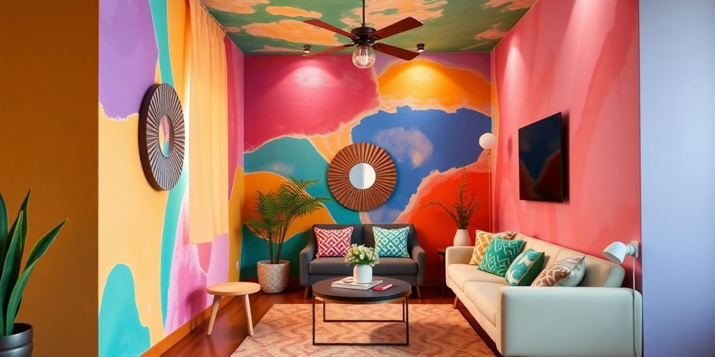
As we step into 2025, it’s time to rethink how we paint our homes. The latest trends are all about blending comfort with creativity. Whether you want to create a cozy retreat or a bold statement, there are plenty of fresh house painting ideas for your interior spaces. From earthy tones to innovative techniques, this guide will help you find the perfect colors and styles to refresh your home.
Key Takeaways
- Earthy and nature-inspired colors are popular in interior design.
- Bold, moody shades are being used to create dramatic spaces.
- Soft pastels and warm neutrals help to make rooms feel inviting and calm.
- Techniques like color drenching and painted trim are gaining attention.
- Choosing the right colors can significantly impact the mood and look of your home.
1. Earthy Greens and Blues
Nature is making a comeback inside our homes! Forget stark whites; in 2025, it’s all about bringing the outdoors in with earthy greens and blues. Think calming, grounding colors that make you feel instantly relaxed. These shades are surprisingly versatile, acting as a new kind of neutral that works with just about any decor style.
Imagine soft seafoam green in a bedroom, creating a tranquil retreat. Or picture a living room painted in a rich navy blue, exuding sophistication. These aren’t just colors; they’re an experience. If you are looking for bedroom painting ideas, these colors are a great place to start.
I’ve been playing around with these colors in my own house, and I’m amazed at how much they’ve changed the vibe. The green in my office makes me feel so much more focused, and the blue in the living room is just so calming after a long day.
Here are a few ways to incorporate these hues:
- Accent Walls: A single wall in a deep forest green can add depth and drama.
- Furniture: Consider a blue velvet sofa or green accent chairs.
- Accessories: Throw pillows, blankets, and artwork in these shades can tie the whole room together.
2. Warm Terracottas and Rich Browns
Earthy tones are back in a big way! Think less sterile minimalism and more cozy, inviting spaces. Terracotta, clay, and those deep, warm browns are perfect for adding depth and a sense of groundedness to any room. I’m personally excited about this trend because it feels so much more livable than some of the cooler palettes we’ve seen in recent years. It’s like a warm hug for your home.
These colors work especially well in living rooms and dining areas, but don’t be afraid to use them as accent walls in bedrooms or even home offices. They bring a timeless, rustic charm that can blend seamlessly with both modern and traditional decor.
I’ve been playing around with some swatches, and I’m finding that these earthy shades are incredibly versatile. They pair beautifully with natural materials like wood and stone, and they can be easily dressed up or down depending on the accessories you choose.
Here are a few ways to incorporate these colors into your home:
- Living Room: Paint a feature wall in a rich terracotta shade and accessorize with woven textures and natural wood furniture.
- Dining Room: Use a warm brown on the lower half of the walls and a lighter, creamier shade above to create a sense of height and spaciousness.
- Bedroom: Opt for a soft, clay-toned paint on all walls for a calming and restful atmosphere.
3. Dusty Pinks and Muted Plums
Dusty pinks and muted plums are making a splash in 2025, offering a sophisticated and calming vibe. These colors are far from the bubblegum pinks of the past; instead, they bring a sense of maturity and elegance to any space. They’re perfect if you want to add a touch of color without overwhelming the room.
These shades work wonders in bedrooms and dining rooms, creating an inviting atmosphere. They also pair well with neutral furniture and metallic accents, giving you plenty of design flexibility. Think of a dusty rose bedroom with gold light fixtures or a plum dining room with a dark wood table – the possibilities are endless.
Here are a few ways to incorporate these colors into your home:
- Paint an accent wall in a muted plum shade.
- Use dusty pink bedding and curtains in the bedroom.
- Add plum-colored throw pillows to a neutral sofa.
I’ve been experimenting with these colors in my own home, and I’m amazed at how versatile they are. They can be both calming and sophisticated, depending on how you use them. I recently painted my guest bedroom a soft, dusty pink, and it instantly transformed the space into a cozy retreat. I highly recommend giving these shades a try!
Consider how these colors interact with natural light. A room with lots of sunlight can handle a deeper plum, while a darker room might benefit from a lighter, dusty blush pinks.
4. Bold and Moody Shades
Okay, so maybe you’re not into the light and airy thing. That’s totally cool! For 2025, we’re seeing a big push towards the dramatic with bold and moody shades. Think deep, saturated colors that create a sense of drama and sophistication. It’s all about creating a space that feels enveloping and luxurious.
These colors are perfect for bedrooms, home offices, or even a dining room where you want to create a sense of intimacy.
Here’s a few things to keep in mind if you’re thinking about going dark:
- Lighting is key: Moody colors absorb light, so make sure you have plenty of it, both natural and artificial. Think about adding lamps, sconces, or even a dimmer switch to control the ambiance.
- Balance is important: Don’t go overboard! Use these colors strategically, maybe on an accent wall or in a smaller room. Too much dark color can make a space feel claustrophobic.
- Texture matters: Pair these colors with rich textures like velvet, leather, or even a chunky knit throw to add depth and interest.
I’ve been playing around with some darker shades in my own house, and I’m honestly surprised at how much I love it. It’s definitely a different vibe than the bright, white walls I’m used to, but it’s so cozy and inviting. I’m thinking of painting my bedroom a deep midnight blue next.
Here’s a quick look at some popular moody shades for 2025:
| Color | Description THE INFORMATION PROVIDED IS INTENDED FOR GENERAL KNOWLEDGE AND DOES NOT CONSTITUTE PROFESSIONAL ADVICE. ALWAYS CONSULT WITH A QUALIFIED PROFESSIONAL FOR ANY SPECIFIC CONCERNS OR NEEDS. THE USER ASSUMES FULL RESPONSIBILITY FOR THE USE OF THIS INFORMATION. THE PROVIDER IS NOT LIABLE FOR ANY DIRECT OR INDIRECT DAMAGES ARISING FROM THE USE OF THIS INFORMATION. ALL RIGHTS RESERVED. THE CONTENT IS PROTECTED BY COPYRIGHT LAWS. UNAUTHORIZED REPRODUCTION OR DISTRIBUTION IS PROHIBITED. THE INFORMATION IS PROVIDED
5. Soft Pastels and Warm Neutrals
Okay, so, I’ve been seeing a lot of people leaning into soft pastels and warm neutrals lately, and honestly, I’m here for it. It’s like everyone’s craving a little bit of calm and serenity in their homes, which, let’s be real, we all need. Think less harsh whites and more creamy beiges, less in-your-face brights and more muted pinks and blues. It’s all about creating a space that feels like a big, comforting hug.
These colors are super versatile, too. You can use them in pretty much any room, from the bedroom to the living room to even the kitchen. And they play well with other colors, so you’re not stuck with just one palette.
Here are a few ways to make it work:
- Pair a soft pastel like dusty pinks with a warm neutral like taupe for a cozy bedroom vibe.
- Use a creamy beige as a backdrop for pops of color in your living room.
- Try a light gray with a hint of green in the kitchen for a fresh, clean look.
I’ve found that these colors really help to open up a space and make it feel brighter, even if you don’t have a ton of natural light. Plus, they’re just so easy to live with. You don’t have to worry about them clashing with your furniture or feeling too overwhelming. It’s all about creating a space that feels good to you.
And if you’re not sure where to start, don’t be afraid to experiment! Grab some paint samples and see what speaks to you. You might be surprised at what you come up with.
6. Color Drenching Techniques
Okay, so color drenching is making a big splash, and honestly, I’m here for it. It’s all about using one color, or shades of the same color, on everything in a room – walls, trim, ceiling, the whole shebang. It might sound a little crazy, but trust me, the results can be pretty awesome. It’s like giving your room a big, warm hug of color.
The idea is to create a cohesive, immersive space where the color really takes center stage. It’s not just about slapping some paint on the walls; it’s about creating an atmosphere. Think about how different colors make you feel – calm, energized, cozy – and then imagine that feeling amplified throughout the entire room.
Here’s the thing, though: it’s not just for small spaces. While it can make a small room feel bigger by blurring the lines, it also works wonders in larger rooms, creating a super dramatic and intentional vibe. It’s all about commitment! If you’re thinking about trying this out, here are a few things to keep in mind:
- Pick your color wisely: This is a big one. You’re going to be surrounded by this color, so make sure it’s one you genuinely love and can live with. Test it out in different lights before you commit.
- Consider the finish: Matte finishes can create a softer, more subtle effect, while glossier finishes will bounce more light around and add drama. Paint trick can be very effective.
- Don’t forget the details: This isn’t just about the walls. Think about painting your doors, window frames, and even your furniture in the same color family to really complete the look.
I’ve been playing around with some swatches, and I’m seriously considering doing my bedroom in a deep, moody blue. I think it would create such a calming and relaxing space. I’m a little nervous about committing to such a bold color, but I think it could be really amazing. Wish me luck!
7. Painted Trim Accents
Okay, so painting the whole room feels like a big commitment? I get it. But what about just the trim? It’s a smaller project, but it can still make a huge difference. Think of it as accessorizing your walls. It’s like adding jewelry to an outfit – it can really pull everything together.
One thing I’ve been seeing a lot of is using trim to highlight architectural details. Got some cool molding? Paint it a contrasting color to really make it pop. Or, if you’re feeling bold, go for a high-gloss finish on the trim to add some drama. It’s all about playing with those little details to create something special.
I’m thinking about trying this in my own living room. The walls are a pretty standard beige, but I’m picturing a deep teal for the trim. I think it would add a touch of sophistication without being too overwhelming. Plus, it’s a relatively easy project that I can tackle over a weekend.
Here are a few ideas to get you started:
- Contrasting Colors: Paint your trim a color that contrasts with your walls for a bold statement. Think dark trim with light walls, or vice versa.
- High-Gloss Finish: Use a high-gloss paint on your trim to add a touch of glamour and reflect light.
- Ombre Effect: Create a subtle ombre effect by painting your trim in a slightly lighter or darker shade than your walls.
Another cool idea is to paint the kitchen cabinets a different color than the walls. It’s unexpected and can really brighten up the space. Or, if you have a staircase, consider painting the risers a fun color. It’s a great way to add some personality to your home. And don’t forget about doors! A brightly colored door can be a real focal point.
I’m also seeing a trend of using different paint finishes to create dimension. For example, you could use a flat paint on the walls and a lacquered finish on the trim. This adds texture and interest to the space without being too overwhelming. It’s all about playing with different textures and finishes to create a unique look.
And if you’re feeling really adventurous, you could even try painting your entryway trim a different color on each floor of your house. It’s a fun way to add some personality and create a cohesive look throughout your home. Just make sure to choose colors that complement each other and the overall style of your house.
8. Vintage Vogue by Benjamin Moore

Okay, so I’ve been seeing this color everywhere, and I’m kind of obsessed. It’s called Vintage Vogue, and it’s by Benjamin Moore. It’s like this super dark, smoky green that’s almost black, but not quite. I think it’s perfect if you want to make a statement without going too crazy.
Vintage Vogue 462 paint color is a great alternative to black or brown. It’s especially cool for kitchens or libraries, especially if you have a lot of shelving. It really makes the woodwork pop. I’m seriously considering using it in my dining room. It’s got this depth that most dark greens just don’t have. It doesn’t just fade into black, you know?
I’m thinking of trying it out in a small space first, like a powder room, just to see how it looks with the lighting. I’ve heard it can look different depending on the time of day, which is kind of exciting. I’m all about those moody vibes right now.
Here’s why I think it’s a winner:
- It’s sophisticated without being stuffy.
- It works well with both light and dark furniture.
- It’s a nice change from the usual gray or beige.
9. Contrasting Paint Finishes

Okay, so you’ve got your color picked out, but have you thought about the finish? In 2025, it’s not just about what color you use, but how it reflects light. Think beyond just matte or gloss. It’s about creating visual interest and depth.
I’m seeing more and more people play around with different sheens in the same room. It’s a subtle way to add a touch of elegance without going overboard. For example, imagine a room with matte walls and lacquered trim. The contrast is so cool!
Here’s a few ideas to get you started:
- Walls: Matte or eggshell (hides imperfections)
- Trim: Semi-gloss or gloss (durable and easy to clean)
- Ceilings: Flat (minimizes light reflection)
I tried this in my own living room last year. I went with a matte finish on the walls and a semi-gloss on the trim. It made such a difference! The room feels brighter and more interesting, and it was a super easy project. I’d recommend it to anyone looking to refresh their space.
Consider using a high-gloss finish on kitchen cabinets for a touch of glam. Or, try a chalk paint for a vintage, textured look. The possibilities are endless! Don’t be afraid to experiment and see what works best for your style.
10. Nature-Inspired Hues
Okay, so, bringing the outdoors inside is still a big thing, and honestly, it’s not going anywhere anytime soon. Think about it: after being cooped up, who doesn’t want a little bit of nature in their home? For 2025, it’s less about bright, in-your-face greens and more about subtle, calming shades that remind you of, well, nature.
Nature-inspired hues are all about creating a serene and grounding atmosphere. It’s like giving your home a big, calming hug.
Think beyond just greens, though. We’re talking about the colors of sand, stone, and sky. It’s a whole palette of earthy goodness. You can even use trendy bathroom paint colors to create a relaxing spa-like atmosphere.
Here’s a few ideas to get you started:
- Earthy Greens: Think sage, olive, and muted forest greens. These are great for bedrooms or living rooms where you want to chill out.
- Sandy Beiges and Browns: These colors bring warmth and a sense of grounding to any space. Perfect for hallways or kitchens.
- Sky Blues and Grays: Soft blues and grays can create a calming and airy feel, especially in bathrooms or offices.
I’ve been playing around with these colors in my own place, and it’s amazing how much of a difference it makes. It’s like my house is breathing a little easier, you know? Plus, it’s super easy to mix and match these colors to create a look that’s totally your own.
Here’s a simple table showing how you might combine these colors:
| Color Palette | Best Room(s) | Mood |
|---|---|---|
| Sage Green + Beige | Bedroom | Relaxing |
| Sky Blue + Gray | Bathroom | Calming |
| Olive Green + Brown | Living Room | Grounding |
Wrapping It Up
So there you have it—ten fresh painting ideas to give your home a new vibe in 2025. Whether you’re into earthy tones or bold colors, there’s something here for everyone. Don’t be afraid to mix and match styles or try out new techniques like color drenching. Remember, your space should reflect who you are and what makes you feel good. So grab that paintbrush and get creative! Your walls are just waiting for a makeover.
Frequently Asked Questions
What are the popular paint colors for 2025?
In 2025, popular paint colors include earthy greens, warm terracottas, dusty pinks, and bold, moody shades.
How can I choose the right paint color for my room?
Consider the mood you want to create. Soft colors can make a room feel calm, while bold colors can add energy.
What is color drenching?
Color drenching is a technique where you paint the walls, ceiling, and trim the same color to create a cozy, unified look.
Are there any eco-friendly paint options?
Yes, many brands offer low VOC or no VOC paints that are better for the environment and your health.
How can painted trim accents improve my space?
Painted trim accents can add depth and detail to a room, making it feel more polished and stylish.
What is the best way to apply paint for a smooth finish?
Using high-quality brushes and rollers, along with proper techniques like even strokes, will help achieve a smooth finish.


Leave a Reply