
Thinking about trying your hand at landscape for painting? It’s a great way to connect with nature and get creative. Sometimes, though, figuring out where to start can feel a bit overwhelming. Don’t worry, we’ve all been there. I’ve put together some straightforward tips that really helped me when I was getting into painting landscapes. It’s not about being perfect right away, but more about enjoying the process and learning as you go. Let’s get those brushes ready!
Key Takeaways
- When composing your landscape for painting, avoid putting your main subject right in the center, and don’t split your canvas exactly in half with the horizon line. Try placing these elements off-center for a more interesting look.
- To give your landscape painting a sense of depth, think about using atmospheric perspective where things farther away look lighter and less detailed. Also, having shapes overlap each other can create layers and make the scene feel more real.
- Learning from other artists is a good idea. Look at how they handle composition and color. Also, try painting scenes from different viewpoints to make your work unique.
- Color plays a big role in how a painting feels. Using colors thoughtfully can create a certain mood, and sticking to a smaller set of colors can help your whole landscape for painting look more unified.
- Don’t feel like you have to paint every single leaf or blade of grass. Simplifying the scene and not overworking the details can actually make your landscape for painting stronger and more impactful.
Understanding Compositional Elements
When you’re setting out to paint a landscape, the first thing to think about is how you’re going to arrange everything on your canvas. This is where composition comes in, and it’s really about guiding the viewer’s eye. Think of it like telling a story; you want a clear beginning, middle, and end, and composition helps you do that visually.
Consider Composition and Focal Points
Every good landscape painting needs a main subject, something that grabs attention. This is your focal point. It could be a striking tree, a distant mountain peak, or even a particular play of light. Without a clear focal point, a painting can feel a bit lost, like it’s just a collection of pretty things without a purpose. You want to draw people into your scene, and the focal point is your primary tool for doing that. Think about what drew you to the scene in the first place – that’s often your focal point.
Never Place Your Focal Point in the Middle
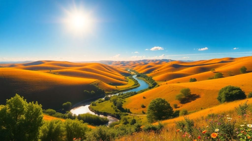
It might seem natural to plop your main subject right in the center of the canvas, but resist that urge. Placing your focal point directly in the middle can make the composition feel static and a bit boring. It doesn’t give the viewer much room to explore. Instead, try using the ‘rule of thirds’. Imagine dividing your canvas into nine equal sections with two horizontal and two vertical lines. Placing your focal point where these lines intersect creates a much more dynamic and engaging image. It feels more natural and encourages the eye to move around the painting. This simple adjustment can make a huge difference in how your landscape feels.
Never Place Your Horizon Line in the Middle of Your Composition
Similar to the focal point rule, keeping your horizon line smack-dab in the middle of your canvas can split the painting in half, making it feel unbalanced. If you have a lot of interesting sky, you’ll want to give it more space. Lower the horizon line to maybe the bottom third of the canvas. Conversely, if the land or foreground is more compelling, raise the horizon line towards the top third. This simple shift helps emphasize the most important part of your scene and creates a more pleasing visual flow. It’s all about deciding what story you want to tell with your landscape.
The way elements are arranged, from the horizon line to where you place your main subject, dictates how a viewer experiences your artwork. It’s not just about what you paint, but how you present it. Playing with these compositional guidelines can really transform a simple scene into something memorable. You can explore your creativity by painting online for free and practicing these ideas without needing any supplies.
Here’s a quick way to think about placement:
- Focal Point: Aim for one of the four ‘power points’ where the rule of thirds lines intersect.
- Horizon Line: Place it on either the top or bottom horizontal line, depending on whether the sky or the land is more dominant.
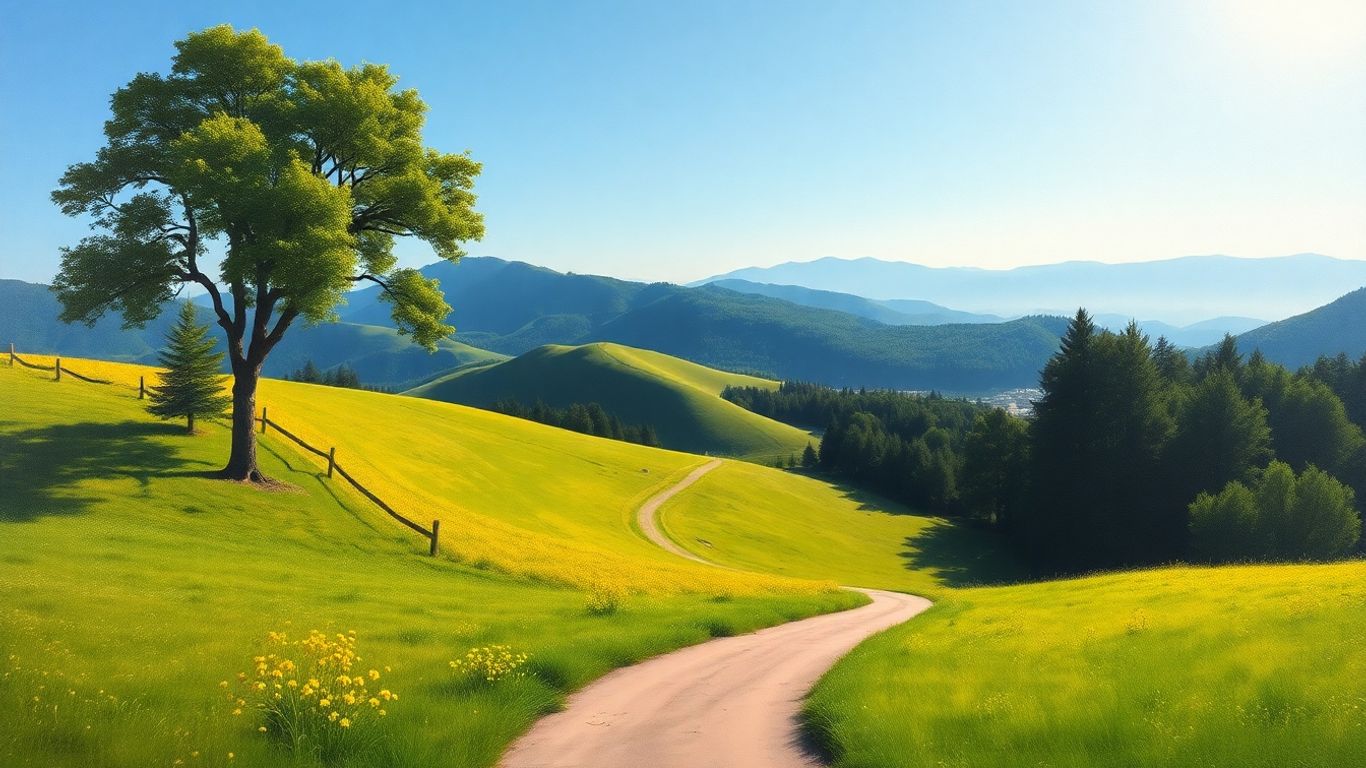
- Leading Lines: Use natural elements like roads, rivers, or fences to guide the viewer’s eye towards your focal point.
Mastering Depth and Dimension
Making your landscape paintings feel real means getting the sense of depth right. It’s not just about what you paint, but how you arrange it on the canvas to give the viewer a feeling of looking into a space.
Create Stunning Depth with Atmospheric Perspective
Think about how things look when they’re far away. They get a bit hazy, right? That’s atmospheric perspective. Colors become lighter and less intense the further back they are. You can use this by making distant mountains a lighter, cooler blue and less detailed than the trees or rocks in the front. This trick really makes your scenes pop and feel vast. It’s like looking through a window into another place. Learning about watercolor techniques for beginners can also help you achieve these subtle shifts in color and value.
Utilize Overlapping Shapes for Layering
Overlapping is a simple but effective way to show what’s in front of what. If one tree is partly blocking another tree, the one in front feels closer. Do this with hills, buildings, or anything in your scene. It creates layers, like stacking pieces of paper. This layering gives your painting a sense of depth, making it feel more solid and believable. It’s a good way to build up your scene from back to front.
Use Neutral Colors for Depth
Sometimes, using less bright colors in the background helps push those elements back. Think about those distant hills again; they often have muted greens or blues. Using desaturated, low-chroma colors for things that are far away can make them recede. This is especially true for greens on distant hills. They aren’t as bright as the grass right in front of you. This technique helps create that hazy, distant look that adds to the feeling of depth.
When you’re trying to create depth, remember that contrast plays a big role. The areas with the most contrast, usually the lightest lights and darkest darks, tend to come forward. So, if you want something to feel far away, make sure it has less contrast. This is a simple rule that makes a big difference in how your painting reads.
Developing Your Artistic Approach
Study the Masters for Inspiration
Looking at the work of artists who came before us is a fantastic way to learn. Think about visiting museums or picking up books featuring landscape painters you admire. Try to copy their work, either by drawing or painting it. Doing small studies of these masterworks can really speed up how much you learn. When you actively try to recreate a piece, you start to notice details you might have missed otherwise. It’s like a deep dive into their process.
Explore Different Perspectives and Angles
Don’t always paint the same view. Try looking at a scene from up high, or down low. Sometimes a slightly different angle can completely change how a landscape feels. Think about how a bird might see the land, or how it looks from ground level. This can add a lot of interest to your paintings.
Paint Loosely First, Then Add Details
When you start a painting, don’t get bogged down in tiny details right away. Begin with broad strokes to get the main shapes and colors down. Think of it as blocking in the big picture. Once you have a solid foundation, then you can go back and add finer points. This approach helps keep your painting from looking too stiff or overworked. It allows the energy of the initial strokes to remain.
Color and Mood in Landscape Painting
Color is a really big deal when you’re painting landscapes. It’s not just about making things look pretty; it’s about how you want the viewer to feel when they look at your work. Think about it – a bright, sunny scene with warm yellows and oranges just feels different than a misty morning with cool blues and grays, right?
Embrace Color Theory for Vibrancy
Understanding basic color theory can really make your landscapes pop. Using complementary colors, like red and green, next to each other can create a really lively effect. But you don’t want everything to be super bright all the time. Sometimes, you need to mute those colors down a bit. Mixing a bit of the opposite color into a hue will tone it down. This is super helpful for creating realistic skies or distant hills that aren’t screaming for attention. It’s all about balance.
Use Color to Create Mood
So, how do you actually use color to set a mood? Well, warm colors – think reds, oranges, and yellows – tend to feel energetic and inviting. They can make a scene feel warm and cozy. On the other hand, cool colors like blues, greens, and purples often give a sense of calm, peace, or even a bit of melancholy. If you want your painting to feel peaceful and serene, leaning into those cooler tones is a good bet. You can also play with color temperature; warmer colors tend to come forward visually, while cooler colors recede, which helps with creating depth.
When you’re out painting or looking at photos, really pay attention to the colors. Are the shadows cool or warm? How does the light affect the colors of the trees or the ground? Comparing different parts of the scene helps you figure out the actual color temperature. It’s not just about what color something is, but how it relates to the colors around it.
Use a Limited Palette for Cohesion
It might sound counterintuitive, but using fewer colors can actually make your painting feel more unified. If you decide your landscape is going to have a certain feel, maybe with blues and greens, try to use those colors throughout the entire piece, even in small amounts in unexpected places. This repetition helps tie everything together and makes the whole painting feel more harmonious. It stops the eye from jumping around too much and creates a more pleasing visual experience. It’s a good way to make sure your painting doesn’t look like a jumble of unrelated colors. You can find some great advice on how to create mood in art using color temperature if you want to dig a bit deeper.
Here’s a quick rundown of how color temperature can affect your landscape:
| Color Temperature | Typical Feeling | Visual Effect |
|---|---|---|
| Warm (Reds, Oranges, Yellows) | Energetic, Inviting, Cozy | Come forward visually |
| Cool (Blues, Greens, Purples) | Calm, Peaceful, Melancholy | Recede visually |
| Neutral (Grays, Browns) | Grounding, Realistic | Add depth and atmosphere |
Refining Your Landscape for Painting
Simplify the Scene for Impact
When you’re painting a landscape, it’s easy to get caught up in all the little details. But honestly, you don’t need to paint every single leaf or blade of grass. Instead, try to focus on the elements that really make the scene pop. Think about what draws your eye and what gives the landscape its character. Leaving out certain details can actually make your painting stronger and more engaging. It’s like telling a story – you don’t need to explain every single thing; let the viewer’s imagination fill in some of the blanks. This approach helps create a more dynamic piece that pulls people in.
Don’t Overwork the Details
This ties right into simplifying. Sometimes, less really is more. If you keep adding tiny details, you can end up with a painting that feels cluttered or loses its overall mood. Try to capture the feeling of the place, the atmosphere, rather than just a photographic copy. The subtle qualities of the landscape can come through in a more abstract way. Your brain is pretty good at filling in the gaps, so a slightly less complicated picture can sometimes feel more detailed than one that’s packed with tiny elements. It’s a balance, for sure.
Take Advantage of Contrast
Contrast is your best friend when you want to make a landscape painting stand out. It’s not just about light and dark, though that’s a big part of it. Think about contrasting colors, like a warm element against a cool background, or contrasting textures, like rough bark next to smooth water. Even contrasting shapes, like sharp, angular rocks against soft, rolling hills, can add a lot of visual interest. Using contrast helps define forms, create a sense of depth, and guide the viewer’s eye through the painting. It’s how you make certain parts of your scene really sing. Remember to consider the rule of thirds when placing your main subjects; it’s a good way to create a balanced composition creating a composition for your landscape painting.
Contrast helps to create focal points and guide the viewer’s eye. It can be achieved through differences in value, color, texture, or shape. Using contrast effectively can make your landscape painting more dynamic and visually appealing.
Enhancing Your Painting Practice
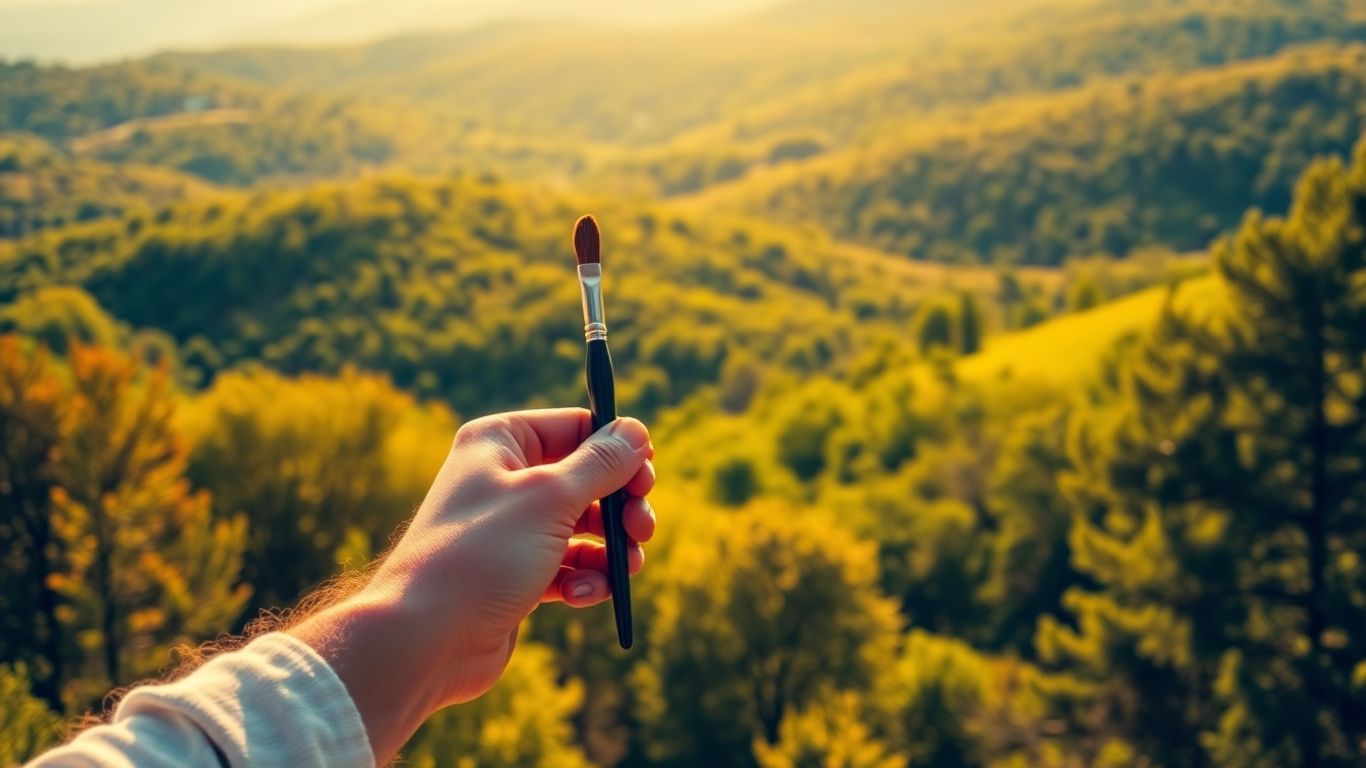
So, you’ve got the basics down, but how do you really push your landscape paintings to the next level? It’s all about how you practice. Getting out there and actually painting is key.
Paint Outdoors En Plein Air
This is a big one. Painting outside, or ‘en plein air’ as the fancy folks say, really speeds up how fast you get better at landscapes. You’re right there, seeing the light, the colors, how everything really looks. It’s way different than just looking at a photo. You can actually feel the atmosphere and get that mood down, which is tough to do from your studio. Plus, you learn to paint faster, which is good for your brushwork. So, seriously, get outside and paint.
Utilize Reference Photos Wisely
Reference photos are super helpful, especially for landscapes. It’s hard to remember every little detail you saw when you were out in nature. Photos help you get the colors and textures right. But here’s the trick: don’t just copy the photo. Use it as a starting point. Change things up, move stuff around, get rid of what doesn’t work for your painting. Remember, you’re making art, not a photograph. Think about how you can use different types of perspective to make your scene more interesting.
Practice Makes Perfect
This sounds obvious, but it’s true. The more you paint, the better you get. Don’t be afraid to try new things or start over if something isn’t working. Experimenting with different colors and techniques is how you find out what looks good. You never know what you might create. Just keep painting, and have fun with it. That’s really the most important part.
Adding Life to Your Landscapes
Making a landscape painting feel alive is all about capturing the energy and movement present in nature. It’s not just about replicating what you see, but about conveying the feeling of being there.
Add Dynamic Skies for Drama
The sky is often the most dramatic part of a landscape, and it’s a fantastic place to inject some life into your painting. Think about the time of day and the weather. A stormy sky with dark, brooding clouds can create a sense of tension, while a bright, clear sky with fluffy white clouds might evoke peace. Don’t be afraid to experiment with bold brushstrokes to capture the movement of clouds. Using a mix of blues, whites, and grays, with a touch of crimson for warmer tones, can really make those clouds pop. Remember, the sky sets the mood for the entire piece.
Incorporate Water Elements and Reflections
Water is another element that brings a lot of dynamism to a scene. Whether it’s a calm lake, a flowing river, or crashing waves, water has a way of reflecting the world around it. Capturing these reflections accurately can add incredible depth and realism. Pay attention to how light hits the water and how it distorts the reflections. Gentle ripples can be suggested with subtle, broken brushstrokes, while smoother surfaces will offer clearer, more defined reflections. Learning to paint water is a bit like learning to paint light itself.
Capture the Essence of Trees and Foliage
Trees and foliage are the lungs of the landscape, and getting them right is key. Instead of painting every single leaf, focus on the overall shapes and textures. Think about how light filters through the leaves and creates patterns of light and shadow. For distant trees or foliage, using desaturated, muted greens can help create a sense of depth and atmosphere. You can explore different brush techniques to suggest the roughness of bark or the softness of leaves. Sometimes, just a few well-placed strokes can convey the entire essence of a tree. If you’re looking for a unique approach, consider reverse painting for a different take on natural forms.
Keep Painting!
So, we’ve gone through a bunch of ways to make your landscape paintings better. Remember, it’s not about being perfect right away. Keep practicing, try out different things, and don’t be afraid to mess up a little – that’s how you learn. Once you’re happy with your work, think about putting it in a nice frame to really make it pop. And don’t forget to show off what you’ve made! Sharing your art is a great way to connect with others and get inspired. Happy painting out there!
Frequently Asked Questions
What’s the best way to start a landscape painting?
Begin by lightly sketching your scene onto the canvas. Then, focus on painting the sky and background elements like mountains or hills. After that, move on to the middle ground and foreground, adding trees or rocks. Finally, add the finishing touches and highlights to bring your painting to life.
How can I make my landscape paintings look more realistic?
To create a sense of depth, use atmospheric perspective. This means making things farther away look lighter and less detailed. Also, try overlapping shapes to create layers, making some objects appear closer than others. Using neutral colors for distant elements also helps.
Should I put the main subject right in the middle of my painting?
It’s usually better to avoid placing your main subject or the horizon line exactly in the center. Try dividing your canvas into thirds, like a tic-tac-toe grid, and place your key elements along these lines or where they cross. This creates a more interesting and balanced look.
How important is color in landscape painting?
Color is super important! You can use color to make your painting feel a certain way, like happy or calm. Learning about color theory helps you pick colors that work well together and make your painting look vibrant and full of life.
What does it mean to paint ‘loosely’?
Painting loosely means using broad, free brush strokes, especially when you’re starting. This captures the energy of the scene without getting bogged down in tiny details. You can always add more specific details later, or even try painting the whole thing in one go!
Is it better to paint indoors or outdoors?
Painting outdoors, called ‘en plein air,’ is a great way to improve. You can see the real light, colors, and how the scene feels. It helps you capture the mood better than just using photos. Plus, it teaches you to paint more quickly!


Leave a comment