

Colors in painting have always been a vital part of artistic expression. They hold the power to evoke emotions, convey messages, and reflect cultural significance. From the vibrant hues of Van Gogh to the soothing tones of Monet, artists have used colors in unique ways to connect with viewers. This article explores the various impacts of colors in painting, covering techniques, inspirations, and the emotional responses they can trigger.
Key Takeaways
- Colors play a significant role in conveying emotions and messages in art.
- Different cultures interpret colors in unique ways, influencing artists’ choices.
- Techniques like color mixing and layering enhance the visual impact of paintings.
- Understanding color theory can improve an artist’s ability to create compelling works.
- Innovations in pigments and digital tools have expanded the possibilities for color application in modern art.
Understanding The Role Of Colours In Painting
Historical Significance
Color wasn’t always as diverse as it is today. Early artists were limited in their painting ideas, often relying on a basic palette. Think back to cave paintings – mostly earth tones, right? Over time, exploration and scientific progress brought new pigments into the mix. The Renaissance and Impressionism, for example, saw artists experimenting with colors never seen before. It’s wild to think about how much the availability of color has shaped art history.
Cultural Interpretations
Color isn’t just about what looks good; it’s loaded with meaning. Different cultures see colors in totally different ways. What’s considered lucky in one place might be a sign of mourning somewhere else. Even within a single culture, the meaning of a color can shift over time. It’s a reminder that art doesn’t exist in a vacuum; it’s always talking to the culture around it.
Psychological Effects
Colors can seriously mess with your head. Ever notice how certain restaurants use red and yellow to make you feel hungry? Artists use this stuff all the time to evoke specific emotions. A calming blue, an energetic red – it’s all about playing with the viewer’s feelings. It’s not just about pretty pictures; it’s about creating an experience.
Color has a huge impact on how we perceive the world. It can influence our mood, our decisions, and even our physical state. Artists understand this power and use it to communicate ideas and emotions in their work.
Here’s a quick look at some common color associations:
- Red: Passion, energy, anger
- Blue: Calm, peace, sadness
- Yellow: Happiness, optimism, caution
- Green: Nature, growth, jealousy
Techniques For Mastering Colours In Painting
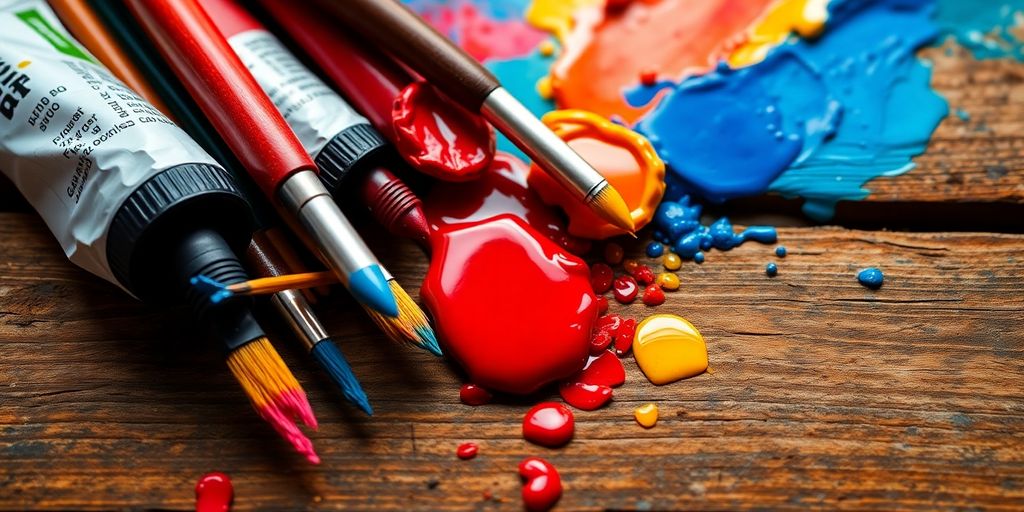
Color Mixing Methods
Okay, so you want to get better at painting? It all starts with mixing colors. Forget those pre-made tubes for a bit. Seriously, understanding how to mix your own colors is like unlocking a secret level in painting. It gives you way more control and helps you actually see color better.
- Start with a limited palette: Try just red, yellow, blue, and white. You’d be surprised how many colors you can make.
- Keep a color mixing journal: Write down the ratios you use to get certain colors. Trust me, you’ll forget otherwise.
- Understand value: Value is how light or dark a color is. Practice mixing tints (color + white) and shades (color + black).
Mixing colors isn’t just about following a recipe; it’s about understanding how colors interact. Pay attention to how different pigments behave and how they affect each other when mixed. This understanding will allow you to create colors that are unique and expressive.
Layering Techniques
Layering is where things get interesting. It’s not just about slapping paint on top of paint. It’s about building depth and creating optical effects. Glazing, scumbling, and impasto are your friends.
- Glazing: Thin, transparent layers of paint. Great for adding subtle color shifts and depth.
- Scumbling: Dragging a dry brush over a layer of paint. Creates a textured, broken effect.
- Impasto: Thick, textured paint application. Adds physical dimension and highlights.
Use Of Complementary Colors
Complementary colors are those that sit opposite each other on the color wheel – think red and green, blue and orange, yellow and purple. Using them strategically can make your paintings pop.
- Simultaneous Contrast: When placed next to each other, complementary colors intensify each other. It’s like they’re shouting for attention.
- Color Harmony: Using a limited palette of complementary colors can create a sense of balance and harmony in your painting.
- Muted Tones: Mixing complementary colors creates neutral or muted tones. These are great for shadows and backgrounds. Experiment with wall design to see how these colors interact in different settings.
Influential Artists And Their Use Of Colours
It’s amazing how different artists can see and use color. Some are super analytical, breaking down how colors interact, while others go straight for the emotional jugular, using color to express deep feelings. Let’s look at a few artists who really stand out for their unique approaches to color.
Vincent Van Gogh’s Emotional Palette
Van Gogh wasn’t just painting what he saw; he was painting what he felt. Color, for him, was a direct line to the soul. Think about his blues – sometimes they’re calming, like a still lake, but other times they’re vast and terrifying, like an endless night sky. And his yellows? They might seem cheerful at first glance, but there’s often an unsettling, almost ominous quality to them. He used color to convey the intensity of his emotions, turning ordinary scenes into powerful expressions of his inner world.
Claude Monet’s Light Studies
Monet was all about capturing light and its effect on color. He’d paint the same scene over and over, at different times of day, in different weather, just to see how the changing light transformed the colors. He was like a scientist, meticulously observing and recording his findings on canvas. He painted over 30 studies of the Rouen Cathedral in 1892 and 1893, exploring the effects of light, weather, and atmosphere on color. It’s a testament to his dedication and his fascination with the way light shapes our perception of the world. This approach to capturing light and color is a cornerstone of Impressionism.
Mark Rothko’s Abstract Fields
Rothko took a different path, creating large-scale abstract paintings with fields of color. He wasn’t interested in depicting objects or scenes; he wanted to evoke emotions directly through color. His paintings are often huge, immersing the viewer in a sea of color. He aimed to bypass the intellect and speak directly to the viewer’s emotions. It’s a pretty powerful experience to stand in front of one of his paintings and just let the colors wash over you. Rothko’s work shows how color can be a subject in itself, not just a tool for representing something else. It’s all about the emotional impact of color.
Rothko’s paintings are meant to be experienced, not just viewed. He wanted viewers to feel something profound when they stood before his canvases, to connect with the colors on a deeply emotional level. He believed that color could express the most fundamental human emotions, from joy and serenity to sorrow and despair.
The Science Behind Colours In Painting
Color Theory Fundamentals
Okay, so color theory can seem intimidating, but it’s really just about understanding how colors interact. Think of it as the grammar of visual language. We’re talking about the color wheel, primary colors (red, yellow, blue), secondary colors (made by mixing primary colors), and tertiary colors (mixing primary and secondary). It’s all about relationships.
- Hue: The actual color (red, blue, green, etc.).
- Saturation: The intensity or purity of a color.
- Value: How light or dark a color is.
Understanding these basics lets you predict how colors will look together and how to achieve specific effects in your paintings. It’s not just about memorizing rules, but about developing an intuition for color.
Impact Of Light On Color Perception
Light is super important. The way we see color is entirely dependent on light. Different light sources can drastically change how a color appears. For example, a color might look completely different under fluorescent light compared to natural sunlight. bedroom painting ideas can be affected by the light in the room. This is why artists often consider the lighting conditions when they’re painting, especially if they’re trying to capture a specific mood or atmosphere.
Pigment Composition And Its Effects
Pigments are what give paint its color. They’re basically finely ground powders that are mixed with a binder (like oil or acrylic) to create paint. The chemical composition of a pigment affects its color, its lightfastness (how well it resists fading), and its mixing properties. Some pigments are transparent, while others are opaque. Some are more vibrant, while others are more muted. Understanding these differences can help you choose the right pigments for your color mixing methods and achieve the effects you want.
Here’s a simplified example:
| Pigment Name | Chemical Composition | Properties |
|---|---|---|
| Ultramarine Blue | Sodium Aluminum Silicate | Vibrant, transparent, good lightfastness |
| Cadmium Red | Cadmium Selenosulfide | Opaque, strong color, can be toxic |
| Titanium White | Titanium Dioxide | Opaque, bright, excellent lightfastness |
It’s a deep dive, but knowing your pigments can really up your painting game.
Exploring Emotional Responses To Colours
Color Symbolism In Art
Color in art isn’t just about making things look pretty; it’s a powerful tool for conveying emotions and ideas. Different colors have accumulated symbolic meanings over time, often varying across cultures. For example, red can represent passion, anger, or danger, while blue often symbolizes peace, tranquility, or sadness. Artists use these associations to add layers of meaning to their work, influencing how viewers perceive and interpret the piece. Understanding body art and its symbolism can really deepen your appreciation for a painting.
The Mood Created By Different Hues
The colors an artist chooses can dramatically affect the mood of a painting. A palette dominated by warm colors like reds, oranges, and yellows can create a sense of energy, excitement, or even anxiety. Cool colors, such as blues, greens, and purples, tend to evoke feelings of calmness, serenity, or melancholy. The intensity and saturation of colors also play a role; bright, vibrant colors can be uplifting, while muted, desaturated colors can create a more somber or reflective atmosphere. It’s amazing how much the mood can shift just by changing the hues!
Personal Interpretations Of Color
While there are general associations with different colors, personal experiences and cultural backgrounds can significantly influence how we perceive them. What one person finds calming, another might find depressing. Our individual memories, emotions, and beliefs shape our unique relationship with color. This subjectivity is what makes art so fascinating; it allows for a multitude of interpretations and emotional connections. It’s like how Monet’s light studies captured different emotions.
Color is deeply personal. It’s tied to our memories, our experiences, and our cultural backgrounds. What resonates with one person might not resonate with another, and that’s perfectly okay. Art is meant to evoke emotion, and color is one of the most powerful tools an artist has to achieve that.
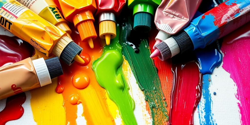
Innovations In Colour Application
The Evolution Of Pigments
Okay, so think about it: color itself has a history. Artists way back when were mixing up soil, animal fat, charcoal, and chalk to get their colors. We’re talking about a basic palette of five colors: red, yellow, brown, black, and white. Can you imagine? Since then, it’s been a constant search for new colors, whether through exploring new places or just plain old science. New pigments popped up right alongside some of the biggest art movements, like the Renaissance and Impressionism. Artists were all about trying out colors that no one had ever seen before in paintings.
Modern Techniques In Color Application
Modern color application is wild. We’ve moved way beyond just slapping paint on a canvas. Think about airbrushing, digital painting, and even using stuff like resin and acrylics in crazy ways. It’s not just about the color itself, but how you put it on. We’re seeing artists use stencils, pouring techniques, and all sorts of mixed media to get effects that were impossible before. It’s a total free-for-all, and that’s what makes it so exciting.
Digital Tools For Color Exploration
Digital tools have completely changed how artists play with color. You can mess around with color schemes, test out different combinations, and see how they look before you even pick up a brush.
Here’s a few things digital tools let you do:
- Experiment with color palettes without wasting paint.
- Simulate different lighting conditions.
- Easily adjust hues, saturation, and brightness.
Digital painting software lets you undo mistakes, try out crazy ideas, and get feedback super fast. It’s like having a whole art studio in your computer. Plus, you can share your work online and get inspired by other artists from all over the world. It’s a total game-changer for color exploration.
Cultural Influences On Colour Choices
Regional Color Preferences
Color isn’t just about what looks good; it’s deeply tied to where you are in the world. Different regions often have distinct color palettes that reflect their history, environment, and traditions. For example, Mediterranean countries often feature bright blues and yellows, mirroring the sea and sun. In contrast, Scandinavian design favors muted tones and natural colors, reflecting their landscape and emphasis on simplicity. These preferences aren’t arbitrary; they’ve evolved over time and are embedded in the local culture. It’s interesting to see how color psychology plays a role in contemporary art.
Historical Contexts Of Color Use
Colors carry a lot of historical baggage. The meaning and use of colors have changed dramatically throughout history. Purple, for instance, was once associated exclusively with royalty because the dye was incredibly expensive to produce. Certain colors might be linked to specific historical events or movements, influencing how they’re perceived today. Understanding this historical context is key to interpreting the use of color in older artworks and appreciating how those meanings have shifted over time. It’s not just about what the artist intended; it’s about what the color meant to the audience of that era.
Symbolic Meanings Across Cultures
Color symbolism varies wildly from one culture to another. What’s considered lucky in one culture might be a sign of mourning in another. Take white, for example. In many Western cultures, it symbolizes purity and is worn at weddings. However, in many East Asian cultures, white is the color of mourning and is worn at funerals. Similarly, red can represent good luck and prosperity in China, while in some Western contexts, it can signify danger or anger. These differences highlight the importance of cultural sensitivity when interpreting art and design from different parts of the world.
It’s easy to assume that colors have universal meanings, but that’s simply not the case. Cultural background significantly shapes our perception and interpretation of color. Artists need to be aware of these nuances to effectively communicate their message and avoid unintentional cultural missteps.
Here’s a simple table illustrating some cross-cultural color associations:
| Color | Western Meaning (General) | East Asian Meaning (General) |
|---|---|---|
| Red | Passion, Danger | Luck, Prosperity |
| White | Purity, Innocence | Mourning, Death |
| Yellow | Happiness, Optimism | Sacred, Imperial |
It’s important to remember that these are broad generalizations, and specific meanings can vary even within a single culture.
Here are some things to consider when thinking about color and culture:
- Research the cultural background of the artist and the artwork.
- Be aware of your own cultural biases and assumptions.
- Consider the historical context in which the artwork was created.
Wrapping It Up
In the end, color in painting is a big deal. It’s not just about slapping some paint on a canvas; it’s about how those colors interact and what they make us feel. Artists like Albers and Rothko show us that there’s a lot to think about when it comes to color. Whether it’s the science behind how colors mix or the emotions they stir up, there’s always something new to learn. So, the next time you pick up a brush or just look at a painting, take a moment to really see the colors. They tell stories, evoke feelings, and can even change how we see the world. Let’s keep exploring and appreciating the power of color in art.
Frequently Asked Questions
What is the importance of color in painting?
Color plays a crucial role in painting as it can convey emotions, set the mood, and create depth in artwork.
How do artists mix colors effectively?
Artists mix colors by combining different pigments to create new shades, often using techniques like blending and layering.
Who are some famous artists known for their use of color?
Famous artists like Vincent Van Gogh, Claude Monet, and Mark Rothko are well-known for their unique and impactful use of color.
What is color theory?
Color theory is the study of how colors interact and the effects they have on each other and on viewers.
How can colors affect our feelings?
Colors can evoke different emotions; for example, blue can feel calm while red can feel intense or exciting.
What are some modern techniques for applying color in art?
Modern techniques include digital painting, spray painting, and the use of new materials that allow for vibrant color application.


Leave a comment