
Picking the right color for your office walls can make a big difference in how you work. It’s not just about making the place look nice; it’s about creating a space that helps you get stuff done. Some colors can help you focus, while others might make you feel more relaxed or energized. In 2025, there are a bunch of colors that are great for boosting productivity in your workspace. Let’s dive into some of the top choices and see how they can transform your office.
Key Takeaways
- Sage Green is calming and helps with focus, making it a great choice for any office.
- Warm Gray adds a touch of sophistication while keeping distractions minimal.
- Sky Blue can make a room feel bigger and helps clear the mind.
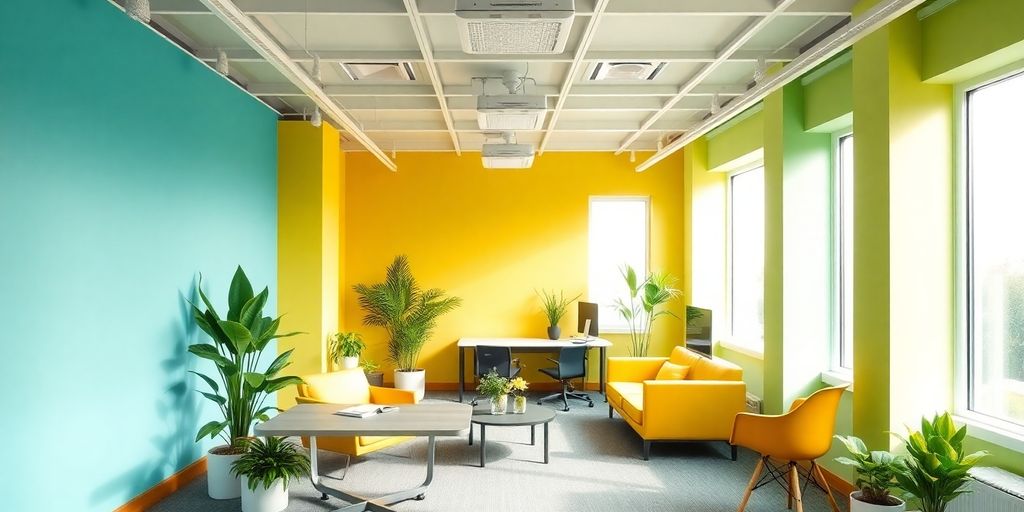
- Soft Yellow brings a bit of sunshine indoors, boosting energy and communication.
- Lavender is perfect for sparking creativity and keeping stress levels low.
1. Sage Green
Sage Green is like a breath of fresh air for your workspace. This calming shade is perfect for anyone looking to boost productivity while keeping stress levels down. It’s not just a color; it’s a mood.
Why Choose Sage Green?
- Promotes Balance and Focus: This shade helps maintain a balance between creativity and concentration, reducing mental fatigue during long work sessions.
- Versatile for Any Room Size: Whether you have a small nook or a spacious office, sage green adapts beautifully, bringing a touch of nature indoors.
- Ideal for South-Facing Rooms: The light enhances its natural tones, making your workspace feel vibrant yet soothing.
Complementary Colors
- Warm Whites: Perfect for trims to keep the space feeling open and airy.
- Soft Beige: Great for accents that add a subtle contrast.
- Deep Brown: Ideal for furniture, adding depth and richness.
Implementation Tips
- Go All-In: Paint all the walls for a cohesive look that envelops the room in tranquility.
- Accent Wall: Consider a darker sage tone on one wall to create a focal point.
- Natural Elements: Pair with wooden furniture or decor to enhance the earthy vibes.
Sage Green transforms your office into a sanctuary—where productivity meets peace. It’s more than just paint; it’s a step towards a more balanced work life.
2. Warm Gray
Choosing the right wall color for your office can significantly impact your productivity. One of the top contenders for 2025 is Warm Gray. This color is known for creating a sophisticated and focused atmosphere, making it an excellent choice for those who need to concentrate on analytical tasks.
Warm gray is a neutral tone that provides a perfect backdrop for concentration without causing visual distraction. It enhances focus and supports analytical thinking, which is ideal for tasks that require detailed attention.
Ideal Work Styles:
- Data analysis and research
- Financial work
- Technical writing
Room Considerations:
- Best for medium to large spaces
- Performs well with both natural and artificial lighting
- Excellent for north-facing rooms
Complementary Colors:
- Crisp white for trim
- Navy blue for accents
- Charcoal for contrast elements
Warm gray can transform your workspace into a hub of productivity, where focus and efficiency thrive. It’s not just a color; it’s a subtle shift towards a more productive you.
If you’re considering a change in your office environment, warm gray might just be the color that ties everything together, offering a professional yet inviting space.
3. Sky Blue
Sky blue is like bringing a piece of the sky into your workspace. It’s a color that promotes a sense of calm and openness, making it a great choice for enhancing mental clarity. When you’re tackling complex tasks, this soothing hue can be your ally.
Key Benefits
- Boosts mental clarity: Sky blue is known for its ability to clear the mind and help with focus.
- Reduces stress: The calming effect of this color can make challenging work feel less overwhelming.
Ideal Work Styles
- Problem-solving and analytical tasks
- Project management
- Client consultations
Room Considerations
- Best suited for small to medium-sized rooms
- Works well with plenty of natural light
- Ideal for east-facing rooms
Complementary Colors
- Pure white for trims
- Light gray for a balanced look
- Deeper blues for accents
Implementation Tips
- Use sky blue on main walls for a fresh look.
- Consider a slightly darker shade for accent walls to add depth.
- Pair with white furniture to create a crisp contrast.
"Sky blue isn’t just a color; it’s a state of mind. It opens up your space and your thoughts, making every workday feel a bit lighter."
4. Soft Yellow
Soft yellow is a color that brings a gentle warmth to any workspace. It’s not just about aesthetics; this hue can actually help in creating a more productive environment. Soft yellow is known to boost mental energy and enhance communication skills, making it a great choice for offices where interaction and collaboration are key.
Key Benefits
- Boosts Mental Energy: Keeps you alert without being overwhelming.
- Enhances Communication: Creates an inviting atmosphere for discussions.
- Stimulates Optimism: Encourages a positive outlook, crucial for team morale.
Ideal Work Styles
- Virtual meetings
- Sales work
- Team collaboration
Room Considerations
- Best for smaller spaces
- Requires good lighting control
- Works well in west-facing rooms
Complementary Colors
- Bright white for trim
- Light gray for balance
- Navy for grounding elements
Implementation Tips
- Use on one or two walls only
- Balance with neutral tones
- Add white elements for freshness
A soft yellow wall can transform a dull office into a vibrant space that encourages open communication and fresh ideas. It’s subtle yet effective, providing just the right amount of energy without causing visual fatigue.
5. Lavender
Lavender is a color that brings together the calming nature of blue with the creative spark of red. This blend makes it a fantastic choice for those looking to boost innovation while keeping a serene atmosphere. Lavender is not just about aesthetics; it’s about creating a space where ideas can flourish.
Key Benefits
- Encourages innovative thinking while maintaining a calm focus.
- Ideal for strategic tasks and creative planning.
Ideal Work Styles
- Creative planning
- Design work
- Strategic development
Room Considerations
- Perfect for medium-sized rooms.
- Benefits from layered lighting.
- Works well in any room orientation.
Complementary Colors
- Cool white for trim.
- Silver gray for accents.
- Deep purple for depth.
Implementation Tips
- Apply to all walls for an immersive effect.
- Use lighter shades for larger spaces.
- Incorporate metallic accents for a modern touch.
Choosing the right office paint color can enhance productivity, lower stress levels, and foster creativity. Lavender, with its unique blend of calming and stimulating properties, is a prime example of this balance. Explore more about choosing the right office paint color.
6. Mint Green
Mint green is a refreshing and invigorating color that can transform any workspace into a haven of productivity. This shade is known for its ability to keep your mind sharp and focused, making it perfect for tasks that require attention to detail.
- Productivity Benefits: Mint green enhances attention to detail while keeping the mind fresh and alert.
- Ideal Work Styles:
- Editing and proofreading
- Detailed documentation
- Quality assurance work
- Room Considerations:
- Ideal for small to medium rooms
- Requires balanced lighting
- Works well in north-facing rooms
- Complementary Colors:
- Crisp white for trim (BM OC-65)
- Pale gray for balance
- Dark green for accents
- Implementation Tips:
- Use on main walls
- Consider a white ceiling for brightness
- Add natural elements for harmony
Mint green not only brings a lively atmosphere but also supports a focused and detailed-oriented work environment. It’s a great choice for those who want a space that feels both energizing and calming. If you’re looking to boost your productivity, this color might just be the key.
For more about how lighter shades of green can enhance creativity and concentration, making them suitable for workspaces, check this page.
7. Navy Blue
Navy blue is a color that brings a sense of depth and focus to a workspace. It’s a shade that can transform an office into a place of concentration and professionalism. When you walk into a room painted with navy blue, there’s an immediate feeling of calmness and seriousness, which is exactly what many people need to get their work done efficiently.
Why Choose Navy Blue?
- Focus Enhancement: This color helps in creating an environment where distractions are minimized. It’s perfect for tasks that require deep thinking and analysis.
- Professional Ambiance: Navy blue lends a touch of elegance and sophistication, making it ideal for executive offices or meeting rooms.
Ideal Work Styles
- Executive decision-making
- Detailed analysis
- High-stakes project management
Room Considerations
- Best suited for larger spaces as it can make small rooms feel even smaller.
- Works well in rooms with plenty of natural light, preferably south-facing.
- Ensure there’s ample lighting to prevent the space from becoming too dark.
Complementary Colors
- Bright white for trims to provide a clean contrast.
- Gold or brass accents to add a touch of luxury.
- Light gray to balance the deep tones of navy blue.
Implementation Tips
- Use navy blue as an accent wall in smaller rooms to avoid overwhelming the space.
- Pair with metallic elements like lamps or picture frames to add dimension.
- Consider using navy blue in spaces where focus and professionalism are key priorities.
"Navy blue doesn’t just paint a wall; it sets the mood for productivity and focus. It’s the backdrop against which ideas flourish and professionalism takes center stage."
8. Peach
Peach is a color that brings warmth and energy to your workspace. It’s like a gentle hug that keeps you motivated without overwhelming you. This hue combines the uplifting qualities of orange with a soft touch, making it perfect for a productive environment.
Key Benefits and Implementation
- Productivity Boost: Peach enhances creative thinking and boosts emotional intelligence, making it ideal for those who thrive on creativity.
- Ideal Work Styles: Perfect for creative brainstorming, social media management, and client relations.
- Room Considerations: Best suited for small spaces, especially those that catch the morning light, like east-facing rooms.
- Complementary Colors: Pair with pure white for trim, sage green for balance, and warm gray for a grounded feel.
- Implementation Tips: Use peach on one feature wall to add a focal point, balance it with neutral furniture, and incorporate natural textures for a harmonious look.
Peach is like a breath of fresh air in your workspace, sparking creativity and keeping the mood light and professional.
For more color recommendations that can transform your home office into a productivity hub, explore color recommendations for home office spaces.
9. Forest Green
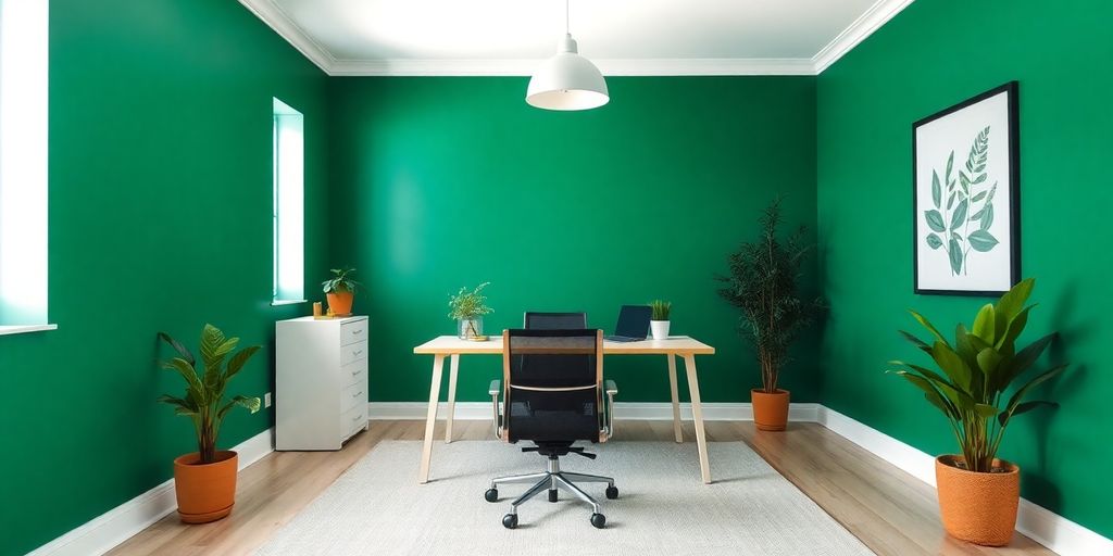
Forest Green is like bringing a piece of the forest into your workspace. It’s a deep, rich color that can transform your office into a sanctuary of focus and calm. This shade is perfect for those who need to concentrate on detailed tasks for long periods.
Why Choose Forest Green?
- Enhances Focus: This color is known to help maintain concentration, making it ideal for tasks that require sustained attention.
- Boosts Reading Comprehension: If your work involves a lot of reading or writing, Forest Green can help improve your comprehension and retention.
- Natural Vibes: This color brings a touch of nature indoors, which can be calming and refreshing.
Ideal Work Environments
- Research and Analysis: Perfect for those who spend their days diving into data or writing reports.
- Academic Settings: Great for students or educators who need to focus on complex materials.
- Creative Spaces: While it’s excellent for focus, it also provides a serene backdrop for creative thinking.
Room Considerations
- Size Matters: Best suited for medium to large rooms where the color can breathe without overwhelming the space.
- Lighting Needs: Works best with balanced, bright lighting to keep the room from feeling too dark.
- Orientation: Suitable for any room orientation as long as lighting is adequate.
Complementary Colors
- Cream for trims adds warmth and contrast.
- Light wood tones for furniture complement the green beautifully.
- Gold accents can add a touch of elegance and sophistication.
Tips for Implementation
- Accent Wall: Consider using Forest Green on a feature wall to create a focal point without overwhelming the room.
- Pair with Lighter Greens: This can add depth and interest without losing the calming effect.
- Natural Elements: Incorporate wooden furniture or decor to enhance the natural feel.
Forest Green is more than just a color; it’s a tool for productivity. By incorporating this shade into your workspace, you’re not just painting walls—you’re creating an environment that supports focus and creativity.
10. Terracotta
Terracotta is a color that brings a unique blend of warmth and sophistication to any office space. This earthy tone is known for its ability to energize a room while maintaining a calm and professional atmosphere. Terracotta can transform your workspace into a hub of activity and focus.
Key Benefits and Implementation
- Productivity Benefits: Terracotta is excellent for stimulating active engagement and boosting physical energy. It’s perfect for those who need to stay alert and dynamic throughout the day.
- Ideal Work Styles:
- Room Considerations:
- Complementary Colors:
- Implementation Tips:
Choosing terracotta for your office walls is like inviting a little bit of nature indoors. It’s a color that doesn’t just sit on the walls but interacts with the space, encouraging a more lively and engaging work environment.
11. Cool White
Cool White, often represented by paint codes like SW 7757, is a classic choice for office spaces. This color is not just about creating a clean and crisp look; it’s about establishing a versatile backdrop that can adapt to various work styles and environments.
Key Benefits and Implementation:
- Productivity Benefits: Cool White promotes clarity of thought and adaptability, making it a favorite for many professionals.
- Ideal Work Styles: This color suits versatile work patterns, multi-purpose spaces, and video conference setups.
- Room Considerations: It’s suitable for any room size and effectively maximizes available light, regardless of the room’s orientation.
- Complementary Colors: Cool White pairs well with any accent color, but it’s particularly effective with blues and greens. Gray tones can also add subtle dimension.
- Implementation Tips: Use Cool White as a base color throughout your space. Add colorful accents for interest and include textural elements for depth.
Choosing Cool White for your office can set a foundation for productivity and creativity, offering a neutral canvas that complements any decor style. Whether you’re setting up for dusty blues or vibrant greens, Cool White provides the perfect balance.
This color’s ability to enhance focus while offering flexibility makes it a top pick for anyone looking to boost their workspace’s productivity in 2025.
12. Calm
When it comes to creating a peaceful and distraction-free office, the color "Calm" is a top choice. This soft neutral tone is perfect for private spaces where focus is key. Its subtle nature helps minimize distractions, allowing you to concentrate on the task at hand.
Key Benefits of Calm
- Enhances focus by reducing visual noise.
- Creates a serene environment conducive to deep work.
- Ideal for private offices where quiet is essential.
Ideal Work Styles
- Perfect for detailed documentation tasks.
- Great for editing and proofreading work.
- Suitable for quality assurance processes.
Room Considerations
- Best suited for small to medium-sized rooms.
- Works well with balanced lighting, both natural and artificial.
- Complements north-facing rooms beautifully.
Complementary Colors
- Crisp white for trim to add contrast.
- Pale gray for balance and harmony.
- Dark green for accents to introduce depth.
Implementation Tips
- Apply on main walls for a cohesive look.
- Consider a white ceiling to enhance brightness.
- Incorporate natural elements to add warmth and texture.
In 2025, commercial offices will embrace colors like Calm to inspire productivity and maintain a motivating atmosphere. This choice reflects a growing trend towards creating workspaces that not only look good but also feel good to be in.
13. Palladian Blue
Palladian Blue is a soft, tranquil shade that blends elements of blue and green, creating a serene environment perfect for a productive workspace. This color is particularly effective in reducing stress and promoting a calm, creative atmosphere.
Key Features
- Stress Reduction: Palladian Blue is known for its soothing qualities, helping to alleviate stress and anxiety in a busy work environment.
- Creativity Boost: The subtle mix of blue and green stimulates creativity, making it an ideal choice for brainstorming sessions and collaborative workspaces.
- Versatile Application: Works well in both small and large spaces, providing a flexible option for various office layouts.
Room Considerations
- Lighting: This color shines with both natural and artificial lighting. It adapts beautifully to different light exposures, maintaining its calming effect throughout the day.
- Ideal for rooms that need a touch of tranquility without sacrificing style.
Complementary Colors
- Crisp white for trim to add a fresh, clean look.
- Soft grays or beiges to balance the palette and enhance the overall serenity.
- Darker greens or blues for accents to add depth and interest.
Implementation Tips
- Use Palladian Blue on main walls to create a cohesive, calm environment.
- Consider pairing with natural wood elements or plants to enhance its soothing nature.
- Add metallic accents for a touch of sophistication and elegance.
Choosing the right color for your workspace can transform your daily routine, making tasks feel less daunting and more enjoyable. Palladian Blue offers a perfect blend of calmness and creativity, making it a top choice for those looking to improve their work environment.
14. Revere Pewter
Revere Pewter is a classic choice for those who want a versatile color that can fit into any office setting. This shade of gray is not just about looking good; it’s about creating the right environment for productivity. Revere Pewter is known for its ability to balance elegance with practicality, making it a favorite for office spaces.
This color works particularly well in meeting rooms where a professional atmosphere is key. Its neutral tone provides a perfect backdrop that doesn’t distract from the task at hand. It’s like the reliable friend who’s always there when you need them, keeping the room calm and focused.
Why Choose Revere Pewter?
- Timeless Appeal: This color has a way of staying relevant, no matter how trends change.
- Versatility: It pairs well with a variety of other colors, making it easy to decorate around.
- Creates a Calm Atmosphere: Ideal for spaces where concentration is needed.
Tips for Using Revere Pewter
- Pair with White Trim: Adding white trim can highlight the beauty of Revere Pewter, giving your office a crisp and clean look.
- Use in Well-Lit Rooms: This color thrives in spaces with plenty of natural light, enhancing its subtle warmth.
- Accent with Bold Colors: Consider adding pops of color with decor or furniture to give the room a bit of personality.
Revere Pewter is like that perfect pair of jeans that fits just right—comfortable, stylish, and always appropriate. It’s a color that doesn’t scream for attention but quietly supports the work being done in the room. Whether you’re in a brainstorming session or a quiet meeting, this color keeps the focus where it should be.
15. Hale Navy
Hale Navy is a powerful color choice that brings a sense of depth and sophistication to any office space. This bold shade is ideal for creating a professional and focused atmosphere, making it perfect for private offices or accent walls.
Key Benefits:
- Focus Enhancement: Hale Navy promotes deep concentration, which is crucial for tasks that require intense focus and attention to detail.
- Professional Ambiance: This color adds a touch of elegance and professionalism to the workspace, making it suitable for executive offices.
- Versatility: While bold, it pairs well with a variety of other colors, allowing for creative flexibility in design.
Ideal Work Styles:
- Detailed documentation
- Complex analysis
- Executive decision-making
Room Considerations:
- Works best in large spaces with plenty of natural light.
- Requires balanced lighting to avoid making the room feel too dark.
- Ideal for south-facing rooms.
Complementary Colors:
- Crisp white for trim to create a clean contrast.
- Light gray for balance and subtlety.
- Brass or gold accents to add warmth and luxury.
Implementation Tips:
- Consider using it on main walls to create a statement.
- Pair with white ceilings to enhance brightness.
- Add natural elements like wood or plants for a harmonious feel.
Choosing the right color for your office can transform your workspace into a hub of productivity. Hale Navy not only enhances focus but also elevates the overall aesthetic, making it a top choice for 2025.
16. White Dove
White Dove is a classic choice for those wanting a workspace that feels open and organized. This shade of white is not just any white; it’s crisp and clean, making it a favorite among those who appreciate simplicity and elegance in their office environment.
Why Choose White Dove?
- Brightens Up Spaces: White Dove reflects light beautifully, making even the smallest rooms appear larger and more inviting.
- Promotes Clarity: A clear workspace can help clear your mind. White Dove creates a backdrop that’s free of distractions, encouraging a focused and productive atmosphere.
- Versatile: This color pairs well with almost any other color, making it easy to incorporate into existing decor or to use as a base for new design ideas.
Tips for Using White Dove
- Pair with Natural Elements: Add wooden furniture or green plants to bring warmth and life to the space.
- Use in Open-Plan Offices: Its versatility makes it perfect for large, shared spaces where different styles might come into play.
- Accent with Bold Colors: Consider adding splashes of color through accessories or artwork to create visual interest without overwhelming the senses.
Choosing soft and easy-on-the-eyes paint colors like White Dove can transform your workspace into a haven of creativity and calm, setting the stage for enhanced productivity and focus.
White Dove, with its timeless appeal, offers the perfect canvas for a productive and serene office environment. Whether you’re updating a home office or a corporate setting, this shade can help create a space that feels both professional and personal.
17. Wythe Blue
Wythe Blue is a color that doesn’t just sit on your walls; it transforms your workspace into a haven of calm and focus. This blue-green shade is like a breath of fresh air, ideal for reducing stress and promoting a serene atmosphere. Imagine stepping into your office and feeling an instant sense of peace.
- Mood Enhancer: Wythe Blue is known for its calming properties, making it perfect for high-pressure environments.
- Versatile Use: It works well in both large and small spaces, ensuring that your office feels open and welcoming.
- Ideal for break rooms or wellness areas, where relaxation is key.
Choosing the right wall color can change how you feel in a space. Wythe Blue offers a subtle yet powerful way to enhance productivity through tranquility.
Implementation Tips
- Use Wythe Blue on main walls to create a continuous flow of calm.
- Pair with crisp white trim to make the color pop and add a touch of elegance.
- Consider adding natural wood elements to complement the soothing tones.
Complementary Colors
- Crisp white for trim (BM OC-65)
- Pale gray for balance
- Dark green for accents
Wythe Blue isn’t just a color; it’s an experience. Whether you’re working on detailed documentation or simply need a space to breathe, this shade can make a significant difference in your daily productivity.
18. Gray Owl
Gray Owl is a paint color with a Light Reflectance Value (LRV) of 64.51, indicating a balance between light and dark. LRV is a scale used by design professionals to measure how much light a color reflects, with 0 being absolute black and 100 being pure white.
Choosing the right paint color for your office can really set the tone for productivity and focus. Enter Gray Owl, a warm, light gray that has become a favorite for many looking to create an inviting yet professional workspace. This color strikes a perfect balance between warmth and neutrality, making it an ideal backdrop for a variety of office styles.
Why Choose Gray Owl?
- Versatility: Its subtle hue works well in both natural and artificial light, making it suitable for any room orientation.
- Enhances Light: With an LRV of 64.51, Gray Owl reflects a good amount of light, brightening up spaces without overwhelming them.
- Neutral Backdrop: It offers a clean slate that complements various accent colors, from bold blues to soft pastels.
Ideal For
- Open Office Spaces: Gray Owl’s ability to enhance natural light makes it a great choice for large, open areas.
- Home Offices: Its calming effect helps maintain focus during long work hours.
- Meeting Rooms: The neutral tone fosters a professional atmosphere conducive to collaboration.
Gray Owl is not just a color; it’s an experience. It subtly transforms your workspace, making it feel open and inviting, yet focused and professional.
Complementary Colors
- Pure White: Perfect for trims and ceilings, creating a sharp contrast.
- Soft Blue: For a calming accent that encourages creativity.
- Warm Beige: Adds a touch of coziness to balance the cool gray.
Incorporate Gray Owl into your workspace to enjoy a harmonious environment that boosts productivity while keeping the vibe relaxed and professional. Its adaptability to different lighting conditions and room orientations makes it a smart choice for any office setting. If you’re considering a change, Gray Owl might just be the color that transforms your office into a hub of productivity.
19. Light Gray
Light gray is like the unsung hero of office colors. It’s subtle, calm, and doesn’t scream for attention, making it perfect for a productive workspace. This color is a favorite for those who need a clear mind and a clutter-free environment to get things done.
Why Choose Light Gray?
- Neutral Backdrop: Light gray acts as a neutral backdrop, allowing other elements in the room to stand out. It’s great for those who love to decorate with vibrant furniture or artwork.
- Enhanced Focus: This color doesn’t distract, which means you can focus better on the tasks at hand.
- Versatile: Works well with almost any color scheme, making it easy to switch up decor without repainting.
Ideal Work Styles
- Technical Writing: Perfect for those who need to concentrate on detailed work.
- Data Analysis: Helps maintain a clear mind for complex tasks.
- Administrative Tasks: Keeps the environment professional and organized.
Room Considerations
- Lighting: Light gray thrives in spaces with good lighting, whether natural or artificial.
- Room Size: Ideal for small to medium rooms but can work in larger spaces with the right accents.
- Orientation: Works well in north-facing rooms where the light is cooler.
Complementary Colors
- Crisp White for trim to keep things clean and bright.
- Pale Blue for a soft contrast that’s easy on the eyes.
- Dark Green for accents to add a touch of nature.
Light gray creates a serene and balanced environment that supports productivity without overwhelming the senses. It’s the go-to choice for those who value simplicity and elegance in their workspace.
For those interested in how color impacts productivity, understanding the subtle effects of shades like light gray can make a big difference in creating a harmonious office environment.
20. Charcoal
Charcoal is a classic choice that offers a sophisticated and modern look to any workspace. This deep gray tone is known for its ability to create a calming and focused environment, making it ideal for tasks that require concentration and attention to detail.
Key Benefits and Implementation:
- Productivity Benefits: Charcoal enhances focus and reduces distractions, allowing for a more productive work session.
- Ideal Work Styles:
- Editing and proofreading
- Detailed documentation
- Quality assurance work
- Room Considerations:
- Ideal for small to medium rooms
- Requires balanced lighting
- Works well in north-facing rooms
- Complementary Colors:
- Crisp white for trim (BM OC-65)
- Pale gray for balance
- Dark green for accents
- Implementation Tips:
- Use on main walls
- Consider white ceiling for brightness
- Add natural elements for harmony
Charcoal walls can transform your workspace into a hub of productivity. With its ability to reduce visual noise, it’s perfect for those who need to focus and get things done. Pairing it with complementary colors like pale gray or dark green can add depth and interest without overwhelming the space.
For those looking to improve their office environment, enhancing office acoustics can be achieved through the use of ceiling and wall treatments, including acoustic panels, baffles, and tiles, which help reduce sound reverberation and improve speech clarity. This can further enhance the productivity benefits of a charcoal-colored workspace.
21. Cream
Cream is a classic choice for office walls, offering a subtle yet warm backdrop that encourages a calm and productive atmosphere. Its versatility makes it a top pick for various work environments.
Why Choose Cream?
- Neutral and Calming: Cream provides a soothing environment, reducing stress and promoting focus.
- Versatile Pairing: This color pairs well with almost any accent, making it easy to match with existing decor.
- Enhances Light: Cream walls can amplify natural light, making spaces feel larger and more open.
Ideal Work Styles
- Administrative tasks
- Creative brainstorming
- Customer service interactions
Room Considerations
- Best for small to medium-sized rooms
- Works well with both natural and artificial lighting
- Suitable for any room orientation
Complementary Colors
- Bright white for trim (BM OC-151)
- Light gray for balance
- Navy for grounding elements
Choosing cream for your office walls can transform your workspace into a haven of peace and productivity, perfect for tackling the day’s challenges with a clear mind.
For more vibrant office paint colors, check out our inspiring color ideas to boost creativity and energy in your workspace.
22. Deep Blue
Deep blue is like the secret weapon for your workspace. It’s not just a color; it’s an experience. This shade creates a calm and focused atmosphere, which is essential for those long work hours. When you’re surrounded by deep blue, you can almost feel your heart rate slow down, helping you to concentrate better.
Why Choose Deep Blue?
- Mood Booster: Deep blue has a soothing effect, reducing stress and anxiety levels.
- Focus Enhancer: Perfect for tasks that require deep concentration, like editing or detailed documentation.
- Versatile: Works well in both small and large rooms, especially if they have plenty of natural light.
Ideal Work Styles
- Editing and proofreading
- Detailed documentation
- Quality assurance
Room Considerations
- Best for north-facing rooms
- Requires balanced lighting
- Complements small to medium-sized spaces
Complementary Colors
- Crisp white for trim
- Pale gray for balance
- Dark green for accents
Implementation Tips
- Use on main walls to create a focal point.
- Consider a white ceiling to keep the space bright.
- Add natural elements like wood or plants to enhance the calming effect.
"A workspace painted in deep blue can transform your productivity levels, creating an environment that feels both professional and serene."
Deep blue is more than just a color choice; it’s a strategy for enhancing productivity and creating a workspace that feels right. Whether you’re tackling complex projects or just need a serene spot to focus, deep blue might just be the answer. Learn more about how blue enhances productivity by fostering a calm environment.
23. Gold
Gold is more than just a color; it’s a statement. In 2025, incorporating gold into your office space can transform not only the aesthetics but also the energy of the room. Gold exudes luxury and confidence, creating an inspiring environment that can boost morale and productivity.
Why Choose Gold?
- Elegance and Sophistication: Gold brings a touch of elegance that can elevate the overall look of your workspace.
- Warmth and Energy: The warm tones of gold can energize a room, making it feel more inviting and lively.
- Versatility: Gold pairs well with a variety of colors, allowing for creative freedom in designing your office.
Implementation Tips
- Accent Walls: Use gold as an accent color on one wall to create a focal point without overwhelming the space.
- Metallic Accessories: Incorporate gold through metallic accessories like lamps, picture frames, or desk organizers to add subtle touches of luxury.
- Balance with Neutrals: Pair gold with neutral tones such as white or gray to maintain a balanced and harmonious look.
Choosing gold for your office walls can be a bold move, but when done right, it turns a mundane workspace into a motivating and stylish haven.
Complementary Colors
- Navy Blue: For a classic and rich look, combine gold with navy blue.
- Charcoal: Add depth and contrast by using charcoal elements alongside gold.
- Crisp White: Maintain a clean and modern feel by pairing gold with crisp white trims.
Ideal Work Styles
- Creative Brainstorming: The luxurious feel of gold can spark creativity and innovation.
- Client Meetings: Impress clients with a sophisticated and stylish office environment.
- Strategic Planning: The energizing properties of gold can enhance focus and motivation during planning sessions.
By integrating gold into your office decor, you align with the anticipated design trends of 2025, making your workspace not only productive but also ahead of the curve.
24. Brass
Brass is a color that brings a sense of warmth and luxury to a workspace, making it a perfect choice for those looking to create a sophisticated yet inviting atmosphere. This rich, metallic hue can inspire creativity and focus, offering a unique blend of elegance and functionality.
Room Considerations:
- Best suited for medium to large spaces where the color can truly shine.
- Requires good lighting to highlight its metallic sheen and prevent the room from feeling too dark.
- Ideal for east-facing rooms that receive morning light, enhancing the warm tones.
Complementary Colors:
- Crisp white for trim to provide a sharp contrast and make the brass stand out.
- Deep blue accents can create a striking balance, adding depth to the room.
- Soft beige for a subtle, harmonious look that complements the warmth of brass.
Implementation Tips:
- Use brass on accent walls to create a focal point without overwhelming the space.
- Pair with natural wood elements to add texture and warmth.
- Consider incorporating brass fixtures or decor items to tie the room together and enhance the metallic theme.
Brass in your office can transform the environment, making it not just a place to work, but a space that inspires and motivates. With the right combination of lighting and complementary colors, brass can elevate your workspace to new heights.
25. Natural Beige
Natural beige is like that trusty old friend who never lets you down. It’s not flashy, but it sure knows how to get the job done. In an office setting, this color can bring a sense of calm and stability, which is exactly what you need when you’re trying to get through a mountain of work.
Why Choose Natural Beige?
- Versatile Backdrop: Natural beige works with almost anything. Whether your office is filled with modern furniture or classic pieces, this color will fit right in.
- Calming Effect: The subtle tone of beige can help reduce stress and create a peaceful environment. It’s like a mini-vacation every time you look up from your desk.
- Enhances Focus: Beige doesn’t distract. It allows you to concentrate on what’s important without pulling your attention away.
Implementation Tips
- Pair with Bold Accents: Use bold colors like navy or forest green for accents to add a bit of drama without overwhelming the space.
- Natural Light: Beige looks best in spaces with plenty of natural light. It can make your office feel warm and inviting.
- Textures and Materials: Incorporate different textures like wood or metal to add depth and interest to your beige walls.
Beige might seem plain, but it’s a powerhouse in the world of office colors. It offers a quiet strength that can transform your workspace into a haven of productivity.
For a deeper understanding of how color affects productivity, check out our explore colour psychology guide to see how choosing the right paint can enhance your work environment.
Conclusion
So, there you have it. Picking the right color for your office walls isn’t just about aesthetics; it’s about creating a space where you can thrive. Whether you’re drawn to the calming vibes of sage green or the energetic feel of soft yellow, the color you choose can make a big difference in how you work. It’s all about finding what clicks for you and your work style. Remember, your workspace should inspire you, not tire you out. So, take some time, test a few colors, and see what feels right. Here’s to a more productive and colorful 2025!
Frequently Asked Questions
What colors can make a small office feel bigger?
Light colors like soft yellow or cool white can make a small office feel more spacious and open.
How do I pick a color that looks good on video calls?
Choose colors with neutral tones that don’t cause glare, like warm gray or pale blue, and test them during video calls.
Can dark colors work in a small office?
Yes, dark colors can work if you use them on one wall and balance with light furniture and good lighting.
What color helps with focus and concentration?
Colors like sage green and navy blue are known to help improve focus and concentration.
How do colors affect mood in the office?
Colors like peach and lavender can boost creativity and mood, while blues and greens are calming.
Which colors are best for creativity?
Colors like peach and lavender are great for sparking creativity and inspiration.


Leave a comment